I. Beginnings and Endings
The Purpose and Objective of this Project
There is a notion that new technology is always better than old
technology.
The longer the time period, the better. But is this really
always true? Over long time periods, we seem to believe that it
is irrevocably true. I doubt that anyone will contradict me when
I state that thirty-year-old computer hardware is worse than
modern day hardware. The processing performance is far worse,
the memory is significantly smaller, its storage media of
diskettes, spinning hard disks are archaic by comparison, and
the input methods are clunky and inelegant.
But old computers were not useless at the time. They enabled
users of the day to produce text documents, spreadsheets,
graphics and, yes, even artwork.
And they still do.
Retro Computing for Academia
This project is part of the Media Arts Histories program of the
Danube University Krems. The objective is to refurbish a
thirty-year-old Atari computer, upgrade it and then - well
within the technical constraints of the day - to use it to
create a five-page comic.
In this project, I want to prove that thirty-year-old hardware
might well be far less capable than modern day hardware, but
that it is not totally useless. I used an Atari Mega STE with a
few expansions to enable the data exchange with modern
computers, to be able to use a modern-day monitor and to record
the actual process using a video capture device. And then I
proceeded to paint a comic story on it in the pixel art style.
The project took roughly six weeks, occasionally with project
days of up to 12 hours. I purchased the old hardware and
refurbished it. I upgraded it with the necessary modern-day
components. I researched and downloaded the necessary software,
then I started creating the comic by sketching out the story,
drawing the characters using pencil, pen, and paper. After
scanning the designs, I laid out the individual elements across
panels and pages, after which I pixelpainted the images in
color, using established work methods like shading, dithering,
and anti-aliasing.
Finally, I lettered the dialog and captions into the panels and
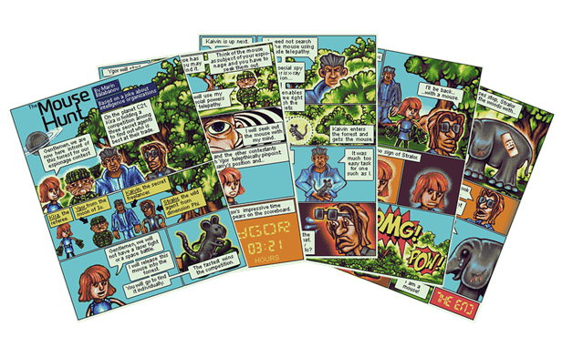
combined them into full pages. The final pixel art comic, which
is the result of this project, can be seen in chapter VII. The
Future was 16-Bit.
Is it an Art Project?
I am not an artist. At most I can admit to being a designer, and
a mediocre one at that. The purpose of this project is not to
discuss whether comics are a form of art, or whether the
aesthetics of pixel art constitute a valuable addition to media
arts history.
Both comics and pixel art have good and bad works. Discussing
whether each medium can be considered art, is like discussing
whether any written word can be considered literature.
For the purposes of this document, I will refer to the graphics
produced as "artwork." I hope that this wording is neutral
enough.
Why Pixel Art?
The mid-1980s were a time of transition for home computer
graphics. On the 16-bit machines of the time, including the
Atari ST, the Commodore Amiga, and the Apple Macintosh, the
graphics capabilities were too limited to allow for much more
than pixel art. They essentially used paint programs to directly
draw the pixels on the screen. The software did offer fill tools
and pattern tools, but the graphics did not allow for more than
a pixel to be drawn at precision. Now, decades later, an image
file in a graphics application can hold much more information
than can be displayed on the screen. Not only are the pixels of
modern day displays nearly imperceptibly small, the image might
be shown at a magnification where not even all of the available
information is displayed.
Yet even in the early days of home computer graphics, the
potential was becoming apparent. The reason why the 16-bit
machines were at a transitional stage was because the
computational power and memory to do more with the images than
simply have a pixel on screen represent a pixel in memory.
Particularly on the Apple Macintosh, the first applications
enabled users to draw in vector graphics. These were composed of
coordinates and color fill information, so they could be zoomed
and displayed at any size without losing their crispness like
pixel graphics.
Yet, due to the limitations of the day, pixel graphics were the
predominant method to create and share graphics. Back then, this
was out of necessity. This led to the familiar “video game”
aesthetic. Today, with the vastly more powerful graphics
hardware that allows for photo quality images, this aesthetic is
by choice and no longer by necessity. Artists choose to produce
pixel art on modern hardware.
Pixel art is interesting because it was limited back in the day,
and it can also be limited by choice today. Some of the most
creative work can be done with clear and well-defined
limitations. Given only 16 colors and an overall palette of 512
possible shades, you can only try to go as far as these
limitations will take you in your effort to accomplish what you
want.
As Mark Ferrari from Terrible Toybox describes it in his talk at
the Games Developers Conference (GDC) in 2016: this creates an
environment that is small enough to be creative in, where
artists can maintain full control over all aspects. They do not
have a giant ineffable cloud of possibilities that can pull them
in any and every direction. Low resolution pixel art with a
limited color palette is a mentally and creatively manageable
space to work in (find his video at
youtu.be/aMcJ1Jvtef0
)
It may seem counter-intuitive, but constraints can have a
liberating effect on creativity. Once you have the ground rules
out of the way, everything else is up to the creative artist.
Just like writers choose to write poems or short stories within
strict formal limitations or length constraints to focus on a
specific message, emotional response or aesthetic, visual
artists can choose to limit the resolution of their images and
the available colors to deliberately produce a desired
aesthetic.
The goal of this project it to make the distinct aesthetic
choice to create a full comic story as pixel art. Furthermore,
the project's objective is to do this using the actual hardware
of the day.
The Purpose of this Document
This document chronicles the process of creating the comic. I
have recorded everything from the very first scribble right and
hardware upgrade, all the way to the character and background
designs and the final pixeling of the finished panels.
This document not only describes the process, but also provides
the finished comic pages. It is a companion piece to the video
documentation in three Youtube videos.
Join me on my journey across time and pixels to produce a pixel
art comic on a magnificently underpowered device from more than
thirty years ago.
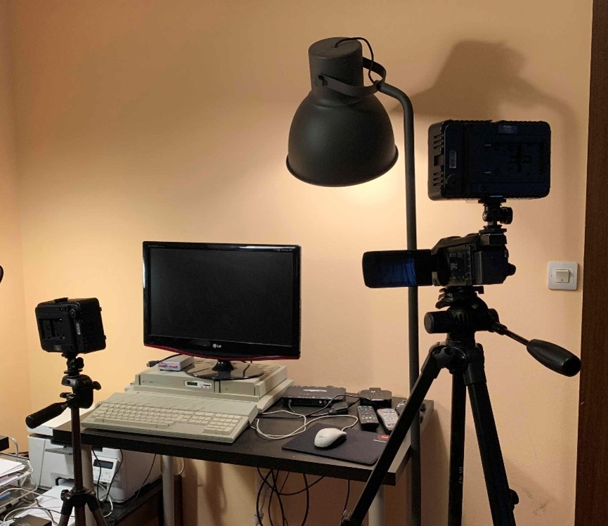
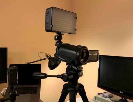
II. Journey Beneath the Metal
Assembling the Equipment
The first thing I wanted to get up and running was the actual
hardware. I wanted to use a 16-bit computer from the 1980s.
While 8-bit computers like the Commodore 64 and the Sinclair ZX
Spectrum dominated the first half of the 80s, the most common
platforms in the latter half were the Apple Macintosh, the
Commodore Amiga, the Atari ST, and most widely used the IBM PC
and its “clones.” The Apple Macintosh of the time was a
black-and-white machine with a small screen. I did not want to
go down that path. The Commodore Amiga was a powerful graphics
machine with capabilities well ahead of its time. This did not
provide the limitations I was seeking. An IBM PC running MS-DOS
using the extremely limited EGA graphics was much too limited,
so I was left with the Atari ST range of computers.
The original Atari ST was introduced in 1985. It was a 16-bit
computer with a Motorola 68000 processor (a.k.a. Central
Processing Unit or CPU). Atari built this machine to compete
with the Apple Macintosh and the Commodore Amiga. It was priced
well below the competition and offered a blend of both of its
competitors' capabilities without fully exceeding any of them.
Atari iterated on the basic technology of the ST from 1985 to
1991. After a number of successors that were not as successful
as the Atari TT and the Atari Falcon, the company folded in the
late 1990s.
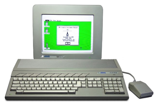
Figure 1: The Atari 1040ST, the first revision of the original
Atari ST
(Source: Wikipedia
upload.wikimedia.org/wikipedia/commons/3/39/Atari_1040STf.jpg)
Choosing the System
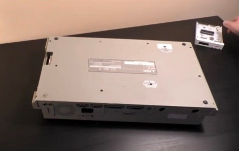
This specific model is the Atari Mega STE which was introduced
in 1991. It is largely based on the original Atari 520ST from
1985 with some minor improvements like a processor running at
twice the clock speed (16MHz up from 8MHz), an extended color
palette and a sound chip capable of digital Pulse Code
Modulation (PCM) for higher quality sound samples. The regular
Atari ST has a keyboard case, i.e. the whole computer is in the
keyboard. The Mega STE had a more professional look, with the
keyboard being separate from the system unit, much like IBM PCs
at the time, but with a sleeker design.
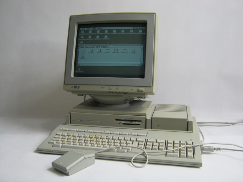
Figure 2: The Atari Mega STE
(Source:
archiwum.allegro.pl/oferta/atari-mega-ste-i7309896659.html
)
The case of the system unit has a built-in 3.5" disk drive and a
fan. This adds annoying background noise during operation, but
the fan makes the computer usable over extended periods of time
by preventing it from overheating. The case also has room for a
hard disk that is attached through the internal SCSI bus.
I purchased my Mega STE from the retro computer retailer Atari
Fachmarkt in Germany for around €300. I decided to use a
retailer instead of eBay because I needed a machine that worked
reliably and had been serviced professionally. The device was in
a great working condition. The retailer had cleaned it and
replaced the electrolytic capacitors that are prone to leakage
after decades of use. The Atari no longer had the original
keyboard but had a replacement unit from a previous line called
the Mega ST (without the "E"). The machine was expanded to its
maximum of 4MB RAM and had the original spinning hard disk with
20MB in it.
Wishlist of Extended Capabilities
So now that I had the computer, I wanted to extend its
capabilities. First of all, I wanted to be able to use a modern
LCD. While I did still own a CRT (Cathode Ray Tube) screen, the
model I had could not cope with the 14.6KHz horizontal sync
signal from the Atari. More importantly, using a CRT at these
low frequencies (50/60Hz vertical refresh) for extended periods
of time is not something I wanted to endure. I wanted to use the
Atari STE to a much more eye-friendly LCD screen. I not only
needed the right cable, but also a way to up-convert the low
horizontal sync signal to be accepted by modern day displays.
The next hardware feature I wanted to change was the 3.5" disk
drive. The drive the machine came with was the original double
density (DD) 720KB version. They do have an MS-DOS compatible
disk format, but they are unreliable when writing to the more
commonly available high density (HD) floppy disks that were
designed to hold 1.44MB. I decided to completely do away with
the disk drive and replace it with a storage medium that I could
use with my MacBook Pro. I wanted to be able to exchange files
between the Atari and my modern working machine.
The built-in hard disk was slow and unreliable. I doubt that I
will ever make full use of its 20MB storage, but I also did not
want to be limited by the small storage space if I ever did. So,
I decided the hard disk had to go.
The last three extensions I wanted to make was to use a
modern-day mouse instead of the original Atari ST mouse that had
a rolling ball with pins tracking it. These mice did not endure
the decades well and are practically unusable today unless they
were kept in the most pristine condition. I wanted to replace
the mouse with a more modern one. Perhaps, I might not even use
the mouse to draw on the Atari, but rather, use a graphics
tablet. The first good consumer models started to become widely
available at the time of the Atari's release. And finally, I
wanted to try networking the Atari Mega STE to my MacBook Pro
for a more efficient mode of data exchange.
Making the Screen Upgrade
Finding the right cable to attach the unit to a more modern TV
was not as difficult as I had imagined. At the time of the
Atari's release the then new SCART TV port had been introduced.
In essence, this was a composite video output in more or less
square port design. This standard was introduced in France in
1976 and it used a 21-pin connector. Also, the port design was
starting to be generally adopted by European TV manufacturers in
Western Europe as of 1987. There was a large aftermarket supply
of Atari RGB to SCART cables. I purchased a working cable
reasonably on eBay. (More about the SCART standard here:
http://fr.meric.free.fr/Articles/articlesba/stsurtvplat/Scart/BS_EN_50049-1%20Peritelevision%20connector.pdf
)
The LG LCD display that I wanted to use with the Atari STE still
had a SCART port on the back. The issue was again the wildly
outdated 14.6KHz horizontal sync signal provided by the Atari.
Even when connected to the LG LCD display, the screen remained
blank because the signal was too weak. I researched a solution
and it quickly became apparent that I needed a video scaler.
According to Wikipedia "a video scaler or upscaler is a system
which converts video signals from one display resolution to
another; typically, scalers are used to convert a signal from a
lower resolution (such as 480p standard definition) to a higher
resolution (such as 1080i high definition), a process known as
"upconversion" or "upscaling" ...So much for Wikipedia.
According to the no more unreliable retro computing forums on
the web, there are dozens of cheap video scalers, but there was
only one true HDMI upscaler worth using: the legendary Micomsoft
Framemeister from Japan. This device had gained popularity in
the retro gaming scene over the past decades. Particularly
gamers who wanted to use their Nintendo Famicom video game
systems and their Sega Megadrives from the 1980s swore by the
Framemeister. The device takes the original low fidelity signal
from the old hardware, runs it through a signal processor and
upconverts it to an HD signal and outputs it to the standard
HDMI port that can be used with most modern-day LCD or OLED HD
TV and monitor. And the Framemeister does the work with a
minimal processing lag.
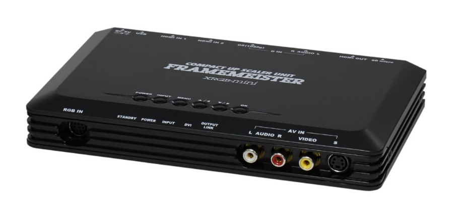
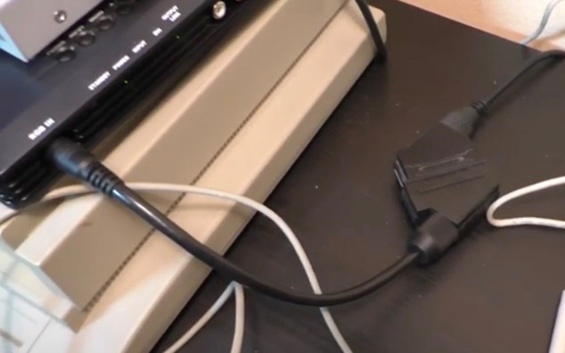
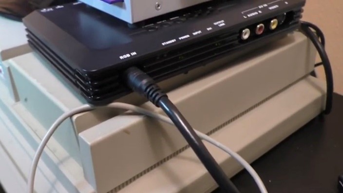
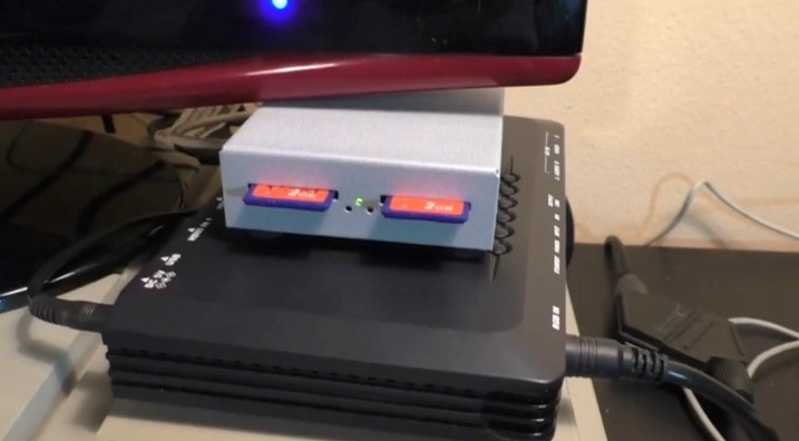
Figure 3: Micomsoft XRGB mini Framemeister HDMI Scaler
(Source:
eurogamer.de/articles/2015-08-20-micomsoft-xrgb-mini-framemeister-hdmi-scaler-test
)
I knew that I had to get a Framemeister. Unfortunately, after a
decade of production and a number of revisions, the manufacturer
had ceased production of this dedicated piece of specialty
hardware. The prices on eBay had skyrocketed. But I did not want
to be deterred by banal setbacks as ridiculous prices, so with
tears in my eyes I shelled out close to €360 to purchase and
import a Micomsorft xRGB Framemeister Mini from Japan.
Weeks later the Framemeister arrived. This HDMI upscaler had a
large assortment of ports, but to my dismay no SCART port. This
should have come as no surprise, as the strictly European SCART
port would be of a low priority in a device manufactured for the
Japanese market where the small, roundly S-Video port had found
a much wider adoption instead. I bought a converter from SCART
to S-Video from a local chain of electronics retailers and could
finally attach the Atari MEGA STE to the LG LCD display. The
very low-fi signal from the Atari was converted and up scaled to
a full HD display. Now, obviously the resolution here is still
the Atari's original low resolution of 320 x 200 but it can be
displayed in full quality on an HD screen. The picture on the
LCD screen was beautifully crisp with consistent colors. The
Framemeister was definitely worth it.
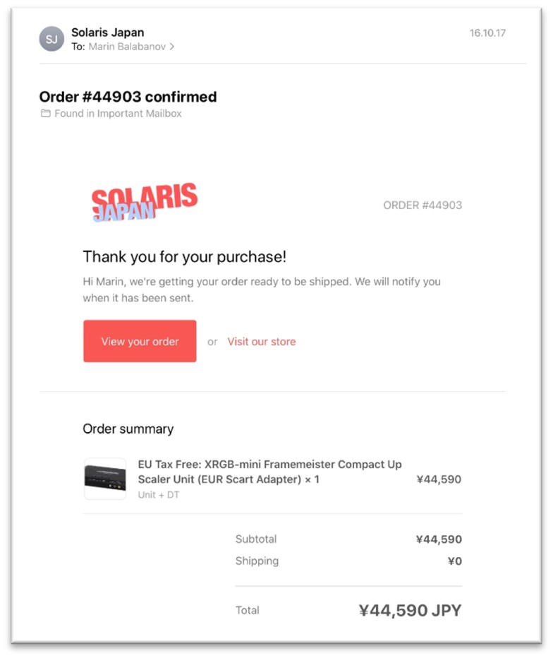
Figure 4: The painful invoice for the Framemeister order from
Solaris in Japan.
Yes, the amount is approx. €380 with shipping
(Source:
Marin Balabanov)
New Floppy Disk Storage
The second extension that I've added is a replacement for the
broken 3.5" floppy drive. This is an HxC floppy drive emulator.
It is pin compatible to the old floppy drives from the day and
replaces the floppy with an SD card. The reason why it is called
a floppy emulator is because it pretends to be a regular floppy
disk drive.
The card cannot be read as it would on a modern machine, but
rather, it contains floppy images, i.e. exact captures of full
floppy disks stored as individual files on the SD card. These
captures of the floppy's content, these floppy images, are
treated just like normal floppy disks by the host computer in
this case the Atari ST. An SD card can hold thousands of images.
Each individual image still only holds around 720KB, but
effectively, the SD HxC is capable of providing thousands of
diskettes to choose from when the machine boots up.
I purchased this from lotarek.pl, a retro computing enthusiast
site in Poland.
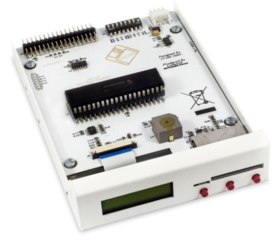
Figure 5: The HxC Floppy Disk Emulator
(Source:
lotharek.pl/productdetail.php?id=28
)
Hard Disk Replacement
I decided to replace the unreliable hard disk with a so-called
UltraSatan. This device houses two SD cards and provides a
standard SATA hard disk interface and a converter to the SCSI
interface needed in the Atari Mega STE. The name is derived from
the SATA interface and is not related to satanism, but rather to
the hobbyist scene's sense of "cool."
The UltraSatan uses the SD cards as virtual hard drives, so the
computer "sees" them as hard disk partitions. The Atari STE
being created to legacy specifications cannot handle the massive
SD card storage available nowadays. Even comparatively "tiny" SD
cards with "only" 2GB are too large for the computer to
recognize them as a whole. There is a solution to that: I
partitioned each SD card into multiple partitions that are no
larger than 512MB. So, I ended up with eight partitions in total
over the two SD cards (with 2GB each).
The UltraSatan is simply attached to the Atari's external hard
disk port as an external device or to the internal SCSI/ACSI
port as an internal device with an appropriate SCSI terminator.
I decided to use the external option because I did not have the
needed SCSI terminator and I also thought it might be useful to
be able to access the SD cards easily without opening the case.
This device was also available at the lotharek.pl retro hardware
online shop. I purchased it for around 90 Euros and added a
couple of low-capacity SD cards to it.
I copied a large assortment of applications, games, and demos
onto the SD cards. Among them were graphics programs such as
DEGAS, Cyber Studio CAD 3D, Cyberpaint NEOChrome, Deluxe Paint,
and many others.
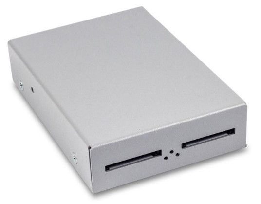
Figure 6: The cased version of the UltraSatan
(Source:
lotharek.pl/productdetail.php?id=48
)
Input Galore
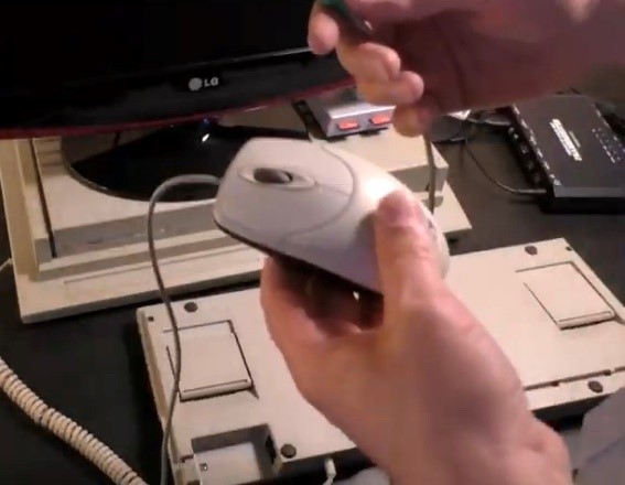
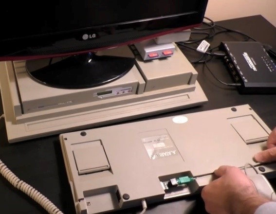
To replace the mouse with a more modern mouse, I used a
converter from PS/2 to 9-pin D-connector. The 9-pin D-connector
is the Atari standard joystick interface that was also used for
the mouse. The PC-standard PS/2 port was introduced by IBM with
its PS/2 line of computers in the late 1980s. Before the wide
adoption of the USB port, the PS/2 port became a de facto
standard for keyboards and mice on MS-DOS/Windows machines. The
PS/2 Converter enables a much more modern PS/2 optical mouse to
be attached to the Atari. The PS/2 connector is not exactly the
most modern interface because that connector started to
deprecate around 2004/2005, but I can nevertheless use a much
more modern mouse than the original Atari model. The Atari's
mouse port (9-pin D-connector) is located underneath the
keyboard. The rather long PS/2 converter just about fits in the
small area, while leaving enough room to attach the actual mouse
cable. These interfaces are custom made and thus quite rare, I
was lucky to stumble upon a PS/2 adapter at the Atari Fachmarkt,
before the shop closed.
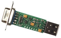
Figure 7: The Adapter for a PS/2 mouse for the Atari ST (Source:
Marin Balabanov)
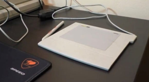
The next input device I wanted to try was a graphics tablet
called the ArtPad II. It is attached to the computer using the
serial port and requires drivers to work with the Atari.
Unfortunately, I never could find drivers for the art pad, given
that this is a very old graphics tablet that was a niche product
for the Atari ST. This was not a critical component, so I let it
be, and instead used the mouse to draw. I bought the ArtPad II
on eBay.
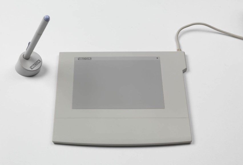
Figure 8: The ArtPad II
(Source:
interface-experience.org/objects/wacom-artpad-ii/
)
Finally, I added a Local Area Networking (LAN) cartridge called
NetUSBee Mini to the Atari. Originally, I had intended to use it
to exchange information with another computer using a LAN cable.
Yet, the available options with the two different SD card
solutions I had installed proved to be sufficient. The slow
transfer speeds and the fussy connection of the LAN cartridge
made it redundant and I never ended up using it beyond the
initial installation phase.
This product I also purchased from lotharek.pl, fine purveyors
of retro hardware.

Figure 9: The NetUSBee Mini
(Source:
lotharek.pl/productdetail.php?id=46
)
The Upgrade Procedure
Now that I've reviewed the end state of the Atari Mega STE with
all of the newly expanded hardware capabilities, I'll outline
the upgrade process.
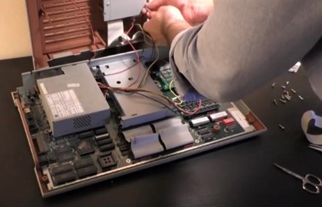
I took apart the Atari Mega STE by detaching all cables and
unscrewing the bottom of the system unit. I detached all the
cables leading to the floppy and to the LEDs for drive activity
and power. This gave me full access to the main board of the
Atari.
Figure 10: Taking apart the Mega STE's case to replace the
internal floppy disk drive (Source: Marin Balabanov)
First, I upgraded the floppy disk, the hard drive, and the fan.
The floppy drive was a drop-in replacement for the SD HxC drive.
I simply unscrewed the floppy drive and then replaced it with
the HxC. I had to make sure that the power cable and the floppy
connectors are attached in the correct orientation and that the
DIP switches on the HxC drive are set to the correct
configuration. Due to the difference in size, some screws were
left over. I removed the hard drive, but did not replace it with
the UltraSatan, because I had opted to use it as an external
device, leaving the internal SCSI port vacant for future use. I
attached the power and the monitor to the Atari to test the HxC
floppy emulator. It would have been a bit of a chore if I had
reassembled the computer only to find out that the drive was
non-functional, thus compelling me to disassemble everything
once more to fix it.
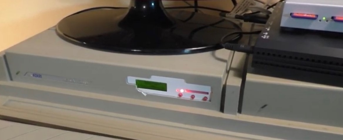
Figure 11: The installed HxC Floppy Drive Emulator (Source:
Marin Balabanov)
Once I was sure the device worked, I needed to provide the
opening in the case for me to insert an SD card into the HxC
once the case is closed. I had to break open part of the case
because the HxC needs a bit more space than a regular floppy
drive. I filed away the excess edges until there was sufficient
room for the HxC drive
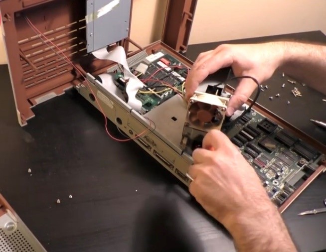
The next step of the operation was the most complex. I wanted to
replace the old fan with a new Noctua NF-a6c25 FLX I got on
Amazon. The old fan was quite loud, which was not unusual for
the time, but technology has moved on since then and the new fan
of exactly the same size, draws less power and is much quieter.
In fact, I'd go so far that it is so quiet as to be being
unnoticeable during regular operations.
Figure 12: Replacing the fan with a new low-noise fan from
Noctua
I found the appropriate installation instructions on retro fan
DBug's blog:
blog.defence-force.org/index.php?page=articles&ref=ART45
To remove the fan, I needed to detach the power supply and
remove it from the case. This was a bit fiddly but allowed me to
unplug the old fan. Once that was done, I replaced it with the
new fan in the same position. I gave the motherboard a final
clean up with some compressed air and then launched attached the
power supply and screwed it in place. Before reassembling the
case, I gave it a final test run to see if the machine draws
power as intended. Once that was clear, I meticulously
reassembled the computer again.
Figure 13: The Framemeister mini xRGB attached to the Atari Mega
STE with all necessary adapters (Source: Marin Balabanov)
The final result of all the travails is an Atari Mega STE with 4
MB of RAM, eight virtual hard drives extending across two SD
cards on an Ultra Satan, a HxC floppy drive emulator for data
exchange, and a network cartridge for LAN.
Figure 14: The "new" PS/2 mouse (left), the PS/2 adapter fitted
into the external keyboard (right)
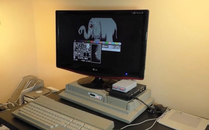
The machine is connected to an LG HD LCD screen display using a
Framemeister. And the mouse is an optical PS/2 mouse connected
using an adapter for the 9-pin D-Connector.
Now that the hardware is prepared and ready for use, we can move
on to the software.
Figure 15: The UltraSatan with the two prepared SD cards sitting
on top of the Framemeister (left), and the ArtPad II attached to
the Atari STE (right)
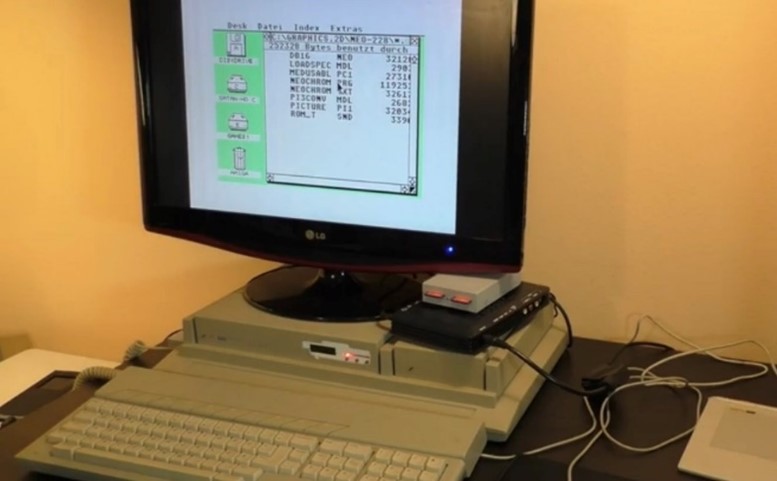
Figure 16: The finished upgraded Atari Mega STE with all
Peripherals
Why not use an emulator or an FPGA?
The big question in this project is likely why I insist on using
original hardware and not simply use emulation on a modern
machine?
Here, I will have to take a step back to explain. I understand
that it seems ridiculous to upgrade a thirty year old computer
with current day storage devices (SD cards), a newer input
device (PS/2 mouse) and a modern day display (HD LCD), instead
of simply using a new computer which comes out of the box with
these features and then simply run an emulator like Hatari (hatari.tuxfamily.org), an SDL-based Atari ST/E and Falcon emulator on MacOS, Linux
or Windows, or the emulator STeem (sourceforge.net/projects/steemsse/) on Windows. I understand that it seems silly to use the old
hardware, but only have little of the charm, e.g. by attaching a
CRT (cathode ray tube) display and using an LCD (liquid crystal
display) instead. Software emulators running on today's vastly
more powerful hardware are not even bound to the same
performance limitations of the original retro hardware. They can
speed up the emulation and pretend to be much faster machines
that could ever have been built from the old components.
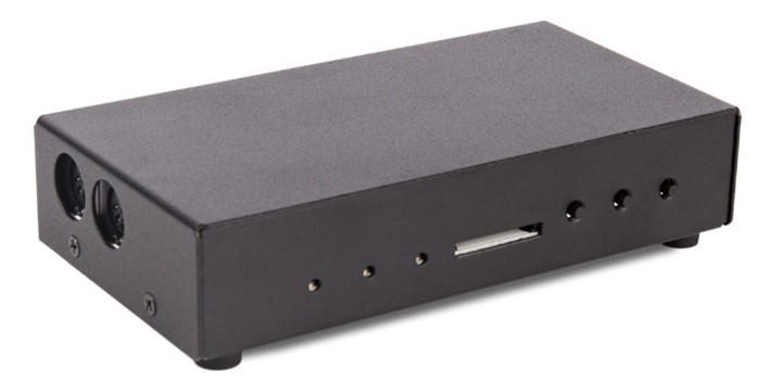
Figure 17: The MiST FPGA model with MIDI ports
(Source:
picclick.fr/MiST-13-FPGA-CLONE-COMPUTER-173823275503.html#&gid=1&pid=2
)
To make things even more convoluted, I could use modern hardware
that does not use emulation. MiST is an FPGA, i.e. a Field
Programmable Gate Array. This is a custom designed integrated
circuit that can be configured (field-programmed) to act and
behave exactly like the original Atari ST hardware. Potentially,
an FPGA can be much more compatible and cycle-accurate than a
software emulator even on the fastest hardware. I own the MiST
FPGA which as the name indicates is an FPGA originally designed
to act as an Amiga and ST (hence amMiga ST), though there are a
multitude of so-called cores (hardware abstractions that turn
the FPGA into the processor and chips of the original hardware)
for a number of retro systems including the Commodore 64, the
Sinclair ZX Spectrum and QL, the Sega Master System, the
original Nintendo Entertainment System, and many more 8-bit and
16-bit systems.
Again, I return to the question: Why use the original hardware?
First of all, the available Atari ST/E emulators no matter how
accurate and compatible are optimized for the vast games library
available for the machine. Graphics applications do run
perfectly fine on Hatari and STeem, but the devil is in the
details. When drawing every single pixel using the mouse, the
tiny timing differences become apparent. The way the old mouse
works, as finicky as it is, introduces an ever so slight lag or
erratic behaviour that makes it exceedingly cumbersome to draw
the total of 640,000 pixels over five pages (where each page is
composed of two screens at 320 x 200).
And I must say, that the mouse behaviour is slightly off in
emulation, even though it is not noticeable when playing games.
Though it may be counterintuitive, it is also an issue using an
FPGA.
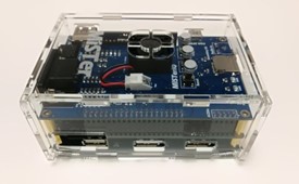
Figure 18: The MiSTer FPGA
(Source:
manuferhi.com/p/mister-fpga
)
Second of all, I want to be as close to the original experience
using the original hardware as necessary, but not suffer from
the unreliability that the spinning disk drives, and old CRT
might have by now.
I don't want to lose my work because of a data loss due to a
failing disk drive or hard disk. While I love the aesthetic of
pixel art on a CRT where the scanlines meld together, I don't
want to risk the project because a CRT starts breaking due to
old age. The Atari ST/E provided a notoriously bad video signal.
In the color display modes, its vertical frequency in the
European PAL region was 50Hz and 60Hz in the US NTSC region. But
it's horizontal scan rate was a paltry 14.4Hz, which made the
original Atari ST unusable with a VGA monitor of the time,
unless it was a rare Multisync model. Using a CRT for extended
periods of time is also not feasible because it tires the eyes.
We might have put up with this thirty years ago, but if using a
CRT can be avoided today then damn well should be.
Finally, the upgraded retro setup does in fact introduce tiny
discrepancies and irritations. I did not use the original Atari
ST mouse with the ball for movement tracking, opting to go with
a late 90s PC mouse that used infrared to track movement across
a surface. The PS/2 to DB8 adapter I used to attach the newer
input device does an admirable job, but the PC mouse
communicates movements slightly faster than the original one.
The IR sensor is much more sensitive than a moving ball with two
rolling pins, it samples the mouse movements at 1200dpi as
opposed to the original approx. 200dpi of the Atari mouse. This
makes the mouse pointer move faster than it should. I managed to
mitigate this by using a small but useful application that was
originally designed to accelerate mouse movements. Instead of
its intended purpose, I used it to slow down the mouse pointer
speed sufficiently to reduce the movement to the original speed.
There is one more thing that speaks for the use of original
hardware: The build quality. Some of the devices from the 1980s
and early 1990s were much more solid and reliable than nowadays
devices. This was not only due to "things simply being better
back in the day." All computers had to comply with much stricter
radio interference standards, and as a result, needed to have
bulkier shielding which made them heavier. Particularly the
predominant desktop computers of the day were less prone to
breakage than today's mobile devices like notebooks, tablets and
smartphones by virtue of being seldomly moved.
As long as the original hardware is available and functional,
and as long as it can be made to interface with modern day
storage and display devices it will always be the more authentic
experience and work as originally intended.
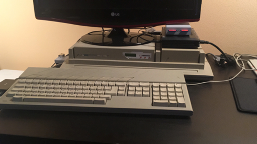
Figure 19: Another view of the fully equipped and upgraded Atari
Mega STE, ready to create pixel art comics (Source: Marin
Balabanov)
III. The Art Software
NEOChrome as the Chosen One
I chose to produce the artwork in NEOChrome, one of the simpler
paint applications on the Atari ST.
NEOchrome was the first paint program developed for the Atari ST
line of computers. While it is primitive by nowadays standards,
NEOChrome offers many features that were not common at the time.
Today we would classify it as a bitmap graphics editor for
editing "raster" or "bitmap" images, i.e. images made of pixels
as opposed to vector graphics that are made of lines and curves.
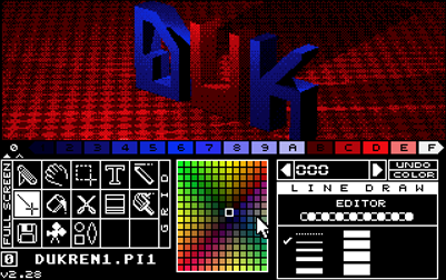
Figure 20: NEOChrome on the Atari ST features many of the same
tools as MacPaint e.g. line and pencil tools, copy and paste
tools, and a text tool. Moreover, it provides powerful rastered
color palette (middle) and basic animation tools. (Source: Marin
Balabanov)
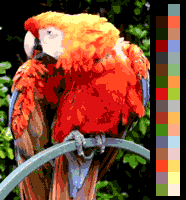
The Atari ST offered an overall palette of 512 colors. However,
in its low-resolution mode of 320x200, only 16 of these colors
could be displayed on-screen at the same time. At 640x200, its
medium-resolution, only four colors could be used and only
monochrome black and white in high-resolution at 640x400. I
decided to use the low-resolution mode with its 16 colors,
because this was the standard maximum. This is quite a
challenge, considering that the human eye can distinguish
millions of colors.
NEOChrome was developed at the Atari Corporation as a tool to
create graphics during the initial development of the Atari ST.
It was written by Dave Staugas, a programmer at Atari and
co-author of the ST's operating system. Early versions of
NEOChrome introduced a nifty animation feature called
color-cycling. Cycling through the colors of a part of the
palette would look like limited animation.
NEOChrome adhered to some of the established user interface
elements of Apple's MacPaint, which had been introduced in 1984
on the original Apple Macintosh. It does have a slight
resemblance to MacPaint by using icons for the tools and the
mouse to draw with.
The user interface of NEOChrome provides many of the same tools
as paint applications of the time. You could draw freehand, draw
lines and shapes, fill areas, you could copy and paste, and you
could add rudimentary text. By today's standards, these are very
pedestrian features that had been established by MacPaint a year
prior and arguably by paint applications on 8-bit computers like
Koala Painter on the Apple II and Commodore 64. NEOChrome did
deviate from the MacPaint-paradigm in one key aspect: the tools
area occupied the lower half of the screen and permanently
showed a magnification zoom at the tip of the drawing tool while
it traversed the canvas (more on this below).
The advanced version, called NEOChrome Master, which also
allowed for simple page flip animation could rotate copied
screen areas in small increments and play chiptune music in the
background during a user's long drawing sessions.
The Zoomed View
It is important to remember NEOChrome was a color paint program
and the image background was black by default as opposed to the
white canvas of MacPaint. In NEOChrome, you could only see the
top half of the painting canvas, while the bottom half was
occupied by the color palette and the tools. At the first sight,
this might seem like a big disadvantage considering the small
screen, but the bottom part of the screen also provided two
ingenious features.
Whenever the user moved the mouse cursor onto the painting
canvas, a part of the bottom half of the screen turned into a
magnifying glass that showed each pixel in the area of the
cursor. This zoomed view updates in real-time and follows the
cursor everywhere it went, so that the user could at all times
see exactly which pixels they were working on.
Color Picker
Whenever the mouse cursor returned to the lower half of the
screen, then the magnifying area reverts to a palette of colors.
Now, this is where things get complicated. On a bare technical
level, the original Atari ST can only simultaneously display 16
colors on the screen from an overall choice of 512 colors, but
in NEOChrome, you can actually see many more colors and pick
which hue to add to your palette from 195 colors that are
displayed in 13 by 15 color boxes the tools area. You can move
the focus of the color selection field to show different colors
from the full total of 512.
The extended NEOChrome Master
Atari Corporation distributed NEOChrome to Atari ST owners for
free. This meant that Dave Staugas did not receive the royalties
from actual commercial sales. So, he decided to no longer
develop the application. Staugas had hidden some of the features
he was not yet satisfied with, particularly the animation
feature. Though he did leave a way to enable the albeit not bug
free feature for more adventurous users. In the meantime, many
pixel artists had adopted NEOChrome as their favorite paint
application because of its speed and the permanent onscreen
zoom.
In the early 1990s, programmers from the German demo group Delta
Force disassembled NEOChrome's binaries to get the source code
and, even though they were working in unfamiliar code, they
started extending the functionalities. They reintroduced the
hidden animation feature, added some more drawing tools, and
improved the rotation feature to rotate objects by single degree
increments as opposed to the previous 90-degree steps.
By then, the new Atari STE that had slightly extended
capabilities had been released. The new machine was still
straddled by the 16 color limitation, but the overall available
colors had been increased to 4096, which meant that color ramps
and gradients were much smoother. The new programmers from Delta
Force now adapted NEOChrome to take advantage of the STE's
extended colors.
What do all the Bits mean?
The Atari ST and Atari STE used a Motorola 68000 central
processing unit (CPU). This was generally described as a 16-bit
processor. The machine's architecture was 16-bit and the
processor communicated with the memory and all other chips using
16-bit lanes. Internally, the Motorola 68000 had a 32-bit
architecture. This meant that the general purpose registers were
32 bits wide and most arithmetic instructions supported 32-bit
arithmetic. Potentially, a computer using a 68000 CPU could
address a maximum of 16 megabytes of RAM, though in practice,
the Atari ST/STE could only be upgraded to 4 MB by default.
The CPU is not the only area, that bits come into play. We have
discussed the graphics limitations of 16 colors out of a total
palette of 512 colors. The Atari ST's display hardware had a
Digital-to-Analog Converter that used 3-bits for each color.
This means that eight levels for each RGB channel (red, green,
and blue) could be displayed. So, the overall RGB palette of 512
colors had 9-bits. The STE models had a Digital-to-Analog
Converter with 4-bits, i.e. sixteen levels per RGB channel, this
made a 12-bit RGB palette with 4096 colors possible.
But enough about bits, lets discuss the actual colors.
512 Colors vs. 4096 Colors
When Atari released the very first STE model of their line-up in
1987, it was a bit of a disappointment. The "E" in STE stood for
enhanced. It was supposed to compete better with the Commodore
Amiga with its advanced graphics and sound using Commodore's
custom chips. The STE's enhancements were not sufficiently
competitive, so they were not widely adopted by developers of
games and other applications. While the regular ST had a palette
of 512 colors with a limit of 16 colors on-screen at the same
time, the enhanced STE had an overall palette of 4096 colors
which allowed for finer gradients and shading, but it was still
limited to the same 16 colors on-screen at a resolution of 320 x
200 pixels. Compare that to the Commodore Amiga that was release
two years prior to the enhanced Atari STE.
In the most common color graphics mode at 320 x 200, the Amiga
could display 32 colors from its palette of 4096. Once you
started to use the less standard modes, you could display 64
colors in "half-brite" mode, where a user defines 32 colors and
the Amiga automatically provided the same colors in half their
brightness. This might sound a bit cumbersome because a user
could not arbitrarily choose all colors in the 64 color palette,
but the halfbrite colors could be used for much smoother
shading.
Figure 21: The regular Atari ST's 9-bit color palette (left),
compared to the Commodore Amiga's 12-Bit color palette
(right)
(Source:
https://en.wikipedia.org/wiki/List_of_monochrome_and_RGB_palettes
)
The Amiga provided the ultimate mode for static images (i.e. not
well suited for action games) called the Hold and Modify mode
(HAM). This effectively abolished all color limitations, and
images on the home computer could use 4096 colors at the same
time. Coupled with the washed-out video displays of the day,
this came close to photorealism.
The Atari STE's "enhanced" graphics did not quite provide the
Commodore Amiga's features. You were limited to 16 colors out of
an expanded palette. Given these graphics features, what was the
point and was it important to pixel artists?
The main difference between a palette capable of 4096 colors and
that of 512 colors are the finer graduations between colors. The
minimum "steps" in intensity that the enhanced STE's 4-bits per
RGB channel allow for, are smaller than the standard ST's 3-bits
per RGB channel. While the limitation of 16 simultaneous colors
is quite a constraint to work with, having a larger available
palette to choose from allows an artist to work with finer
shading.
Tangent: Overcoming the Atari ST's 16 Color Limitation
Some of the more perceptive readers of this document might
rightfully ask: if the Atari ST can only display 16 colors
on-screen at the same time, how can NEOChrome show 195 colors to
pick from on the bottom half of the screen?
This is where palette-switching comes in. Dave Staugas, the
developer of NEOChrome, used a software technique to traverse
these hardware limitations. While it is true that an Atari ST
screen can display 16 paletted colors, Staugas takes advantage
of the way the screen builds an image. On a Cathode Ray Tube
(CRT) monitor, the image is built line by line from top to
bottom as the cathode ray traverses the width of the image. This
happens so fast that a full screen is projected 50 times per
second (in the European PAL TV standard) or 60 times per second
(in the North American NTSC TV standard).
Staugas wrote the NEOChrome color palette in such a way that he
took advantage of the precise timing that the individual scan
lines need to display the full image. In the tools section, he
switches the palette of the available 16 colors while the image
was being built on the screen - every five or so pixels in the
color picker section. This allowed him to overcome the hardware
limitations of the Atari ST through clever programming.
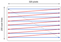
Figure 22: Illustration of the path of the electron beam on a
CRT display (Source: Marin Balabanov)
Interrupts of the processor were occasionally used to swap out
the 16 colors of the palette part way through drawing the
screen. The most straightforward way was to do this at the start
of every raster line. Then every line drawn on the screen had
its own palette. Applications far more advanced than NEOChrome
could change the palette in the middle of a line to achieve 48
colors per line. This method is much more computationally
intensive and requires precise timing of the display hardware.
Alas, this programming trick was only used for the comfort of
the user, so that they can select the right color for their 16
color palette instead of putting each individual hue together
from its RGB values. This does not mean that pixel artists could
actually paint in more than 16 colors on the screen.
There were other paint programs that used the same advanced
programming techniques to transcend the original limits of the
ST's hardware and enable pixel artists to use as many of the 512
colors available on the Atari ST in their pictures at the same
time. The big disadvantage of these tricks is that the more
colors you use beyond the limitation, the slower the application
becomes. The Atari ST's Motorola 68000 CPU needs to put in the
extra work to switch palettes at every scanline, or even
multiple times per scanline. The most famous paint applications
to use the palette-switching trick were Antic Software's
Spectrum 512 (1987), GFA Systemtechnik's GFA Artist (1987), and
Eidersoft's Quantum Paint (1988).
For the purposes of this project, we will focus on the Atari
ST's native limitation of 16 colors.
The Right 16 Color Palette
Now that we have gone through all the technical aspects of
colors on the Atari ST/STE, the next big decision was to select
the right colors. The easiest method is to pick three main
colors e.g. blue for the sky, a skin color, and green for the
forest backgrounds and then simply create four or five shades
(ramps) for each. If you account for white and black, this
occupies all 16 colors.
I didn't want to use the easy method. This is limited and makes
the resulting palette to miss the brown tones needed for the
trees, as well as the grey tones needed for some of the other
characters in the comic.
Putting together a versatile palette with only 16 or 32 colors
has been the holy grail for many a pixel artist. Fortunately,
the community at the pixel art platform called Pixel Joint
(pixeljoint.com) has been slowly chipping away at this problem
over the decades. There have been a number of strong and
versatile palettes put together by community members, but the
general consensus is that the best 16 color palette was put
together by the user Dawnbringer. He has created three powerful
palettes, one called DB8 with 8 colors, another with 16 colors
called DB16, and DB32 with 32 colors that can be used on a
Commodore Amiga. He has made the palette available on Github for
general use at
github.com/geoffb/dawnbringer-palettes
DB16 is particularly well suited for the Atari STE because it
uses only 16 colors, but requires 4-bit 4096 color palette.
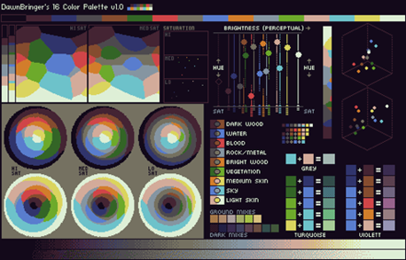
Figure 23: DawnBringer's DB16 color palette... yes, these are
only 16 colors!
(Source:
http://pixeljoint.com/forum/forum_posts.asp?TID=12795
)
Dawnbringer's DB16 colors do not use straightforward ramps for
each of the "main" colors, rather, the colors occupy a very wide
range of hues, while some colors provide different intensities.
This allows them to be combined with each other, depending on
whether a specific object should be shaded from light to dark or
from one hue to another without any change in brightness.
Let's look at an example. DB16 has three widely different tones
of blue, three grey tones, two brown tones, only two greens,
orange, a Caucasian skin tone, and yellow. The brightest color
is not white, but a bluish off-white. The darkest color is not
pure black but an unbalanced dark grey with a nearly
imperceptible blue tinge to it. This smart selection of colors
enables an artist to ramp from dark to light in different
combinations. Instead of using a light green and then make a
gradient to slightly darker shades of green to end up in a dark
green and black, the artist can set the two green tones in the
middle of the intensity, but use dark brown and the dark
off-gray for the darker gradients, while using yellow and the
bright off-white for the lighter sections. This method can be
used to create admittedly limited and perhaps not extremely
smooth ramps for each of the colors, but it creates the
impression that there are many more colors available.
I chose to adopt Dawnbringer's DB16 palette for the comic story.
Pixel Art Techniques
Before we jump into the actual creation process, I would like to
describe two standard techniques in pixel art that I used for
the comic art: Dithering and Anti-Aliasing.
Dithering
Even using the expanded Atari STE color palette, the perceptible
differences in intensity between different tones is too great
and jarring even if two related tones are used for large
adjacent areas. They will then look like two distinctly colored
areas. Dithering individual pixels between the two colored areas
makes them blend together better.
Figure 24: Dithering creates smoother gradients - left, as seen
in the zoomed view of the interspersed pixels of alternating
color - right. (Source: Marin Balabanov)
At the intersection between the two colors, the artist begins to
color one pixel with a color and then the one next to it in the
other color. They then continue to do this chess board style
effect along the intersection between the colors
Anti-aliasing
The low resolution of the pixel art on the Atari ST creates
jagged edges when drawing curves and circles, particularly when
the contours have a very contrasting color to the background.
These "jaggies" are called Aliasing. The edges can be
counteracted by adding pixels of the intermittent colors between
the jagged edge and the background.
Figure 25: Placing shaded pixels between areas of high contrast
diminishes the jagged steps between pixels and slightly offsets
the low resolution (Source: Marin Balabanov)
Combining Images to Single Page
As a true pixel art application, NEOChrome restricts the
available canvas size to the screen size and resolution. This
means that I can only paint in 320 x 200, giving me a
horizontally rectangular canvas. The objective of the project is
to produce five comic pages. A regular printed page is
vertically rectangular. I decided to solve this by painting half
the printed page as a screen in NEOChrome. This means that for
each printed page, I created two images at 320 x 200 each.
When I had completed all of the half-page images, I exported
them in IFF format. Ironically, this is the Interchange File
Format originally developed on the Atari ST's competitor
Commodore Amiga. I needed to be able to maintain the expanded
STE colors. This is not supported by the standard ".NEO" format
of NEOChrome.
I then loaded up the image halves into another piece of art
software on the Atari ST called Invision Elite Color. There, I
combined the image pairs into single pages of 320 x 400.
IV. Drawing before Pixeling
Planning the Story and Designing the Visuals
Now that all the hardware and software are set up and in place,
I can start with the actual comic. I went through a couple of
drafts for the story. At first, I wanted to write an original
story and draw that, but then, I decided that this would take
too much focus away from the actual task at hand: drawing the
story.
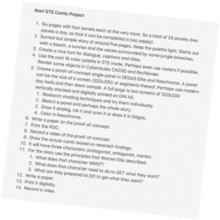
Figure 26: The very first original outline for this project from
2018
(Source: Marin Balabanov)
The Story
There is a decade old joke in many totalitarian states about a
competition between three intelligence or security services from
different countries. The joke comes in many permutations, but
usually it is about an American intelligence service, an Israeli
or British service, and the local intelligence service from the
totalitarian country the joke comes from. The first time I heard
the joke, it was about the Soviet-Union, then I heard a variant
from Syria. When researching the joke for this project, I found
that there are versions from Eastern Germany and North Korea as
well.
The original joke goes something like this:
Three intelligence services have a competition to determine who
is the best. The referee releases a mouse in a forest and then
sends in a contender from the first service to find the mouse.
After a day they return with the mouse. They are successful, but
the time they needed was rather long. Another mouse is released
into the forest and a member from the next service goes in to
find it. They return with the mouse in a ridiculously short
time. They are not only successful, but they are really fast.
Finally, the referee releases another mouse and a member of the
last intelligence service goes in to find the mouse. Now please
keep in mind that this is the local service from the
totalitarian state like the Soviet Union or the German
Democratic Republic. The last contender is not seen for hours,
then days pass, and after a week they return. They bring back an
elephant.
The referee is shocked. They protest that the animal the
intelligence person brought back is not a mouse! Then the
elephant says: "Yes! Yes, I am! I confess to everything. I am a
mouse."
The main message of the joke is that the local intelligence
service of the totalitarian state is quite incompetent, but they
get results at any costs. In this case, they tortured an
elephant until it confesses to be a mouse.
As a project for a university course with the focus on the media
aspects, I definitely did not want to get into any slippery
political territory and use countries that actually exist. This
would detract from the objective and perhaps be the cause for
unnecessary discussions. So instead, I decided to use alien
characters with superpowers on a different planet. Though to be
fair, I did make sure that they are human-looking and perhaps
even have a bit of the characteristics of the contenders in the
original joke.
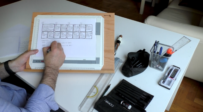
The Synopsis and the Breakdowns
Once I had decided which story to use, I drafted up a synopsis
of the story. I split the rough synopsis into an approximate
page count, attempting to keep to around four pages, as
originally planned. The result was a synopsis of five pages with
five to eight panels each, because I needed more room for the
story. The synopsis also enabled me to note how many characters
appear in the story, which settings will be needed, and the
props required.
Then I drew the so-called thumbnail breakdowns, i.e. tiny
layouts of each page. As a result of the thumbnails I realized
that there are a couple of key panels missing, and I adjusted
the story accordingly.
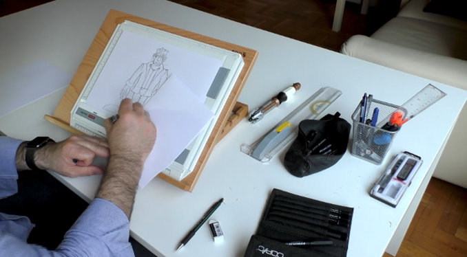
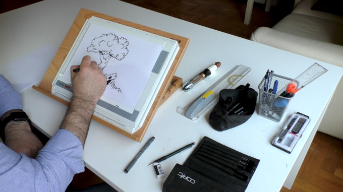
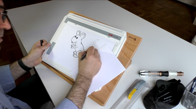
Based on the character list, I sketched the figure with a
technical pencil working my way from basic shapes to a tight
pencil sketch. Then I cleaned up the contours with a technical
pen. I erased the pencil lines and with a black marker or brush
pen, I then re-enforced some of the lines and fill in the blacks
where they were needed.
This particular story needed four character, two backgrounds
(mostly consisting of trees), a mouse and an elephant. The story
was set outdoors in front of a forest.
Figure 27: Creating the thumbnail layouts (top left), sketching
the one of the characters (top right), drawing the backgrounds
(bottom left), finishing the mouse character (bottom right)
(Source:
Marin Balabanov)
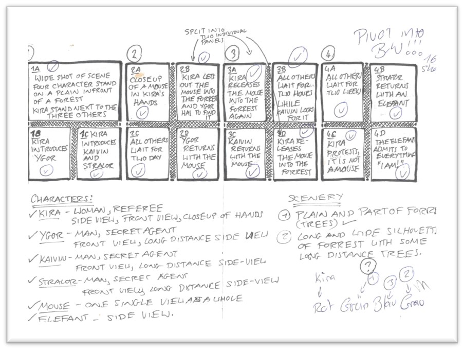
Figure 28: The breakdown of the plot of the comic (Source: Marin
Balabanov)
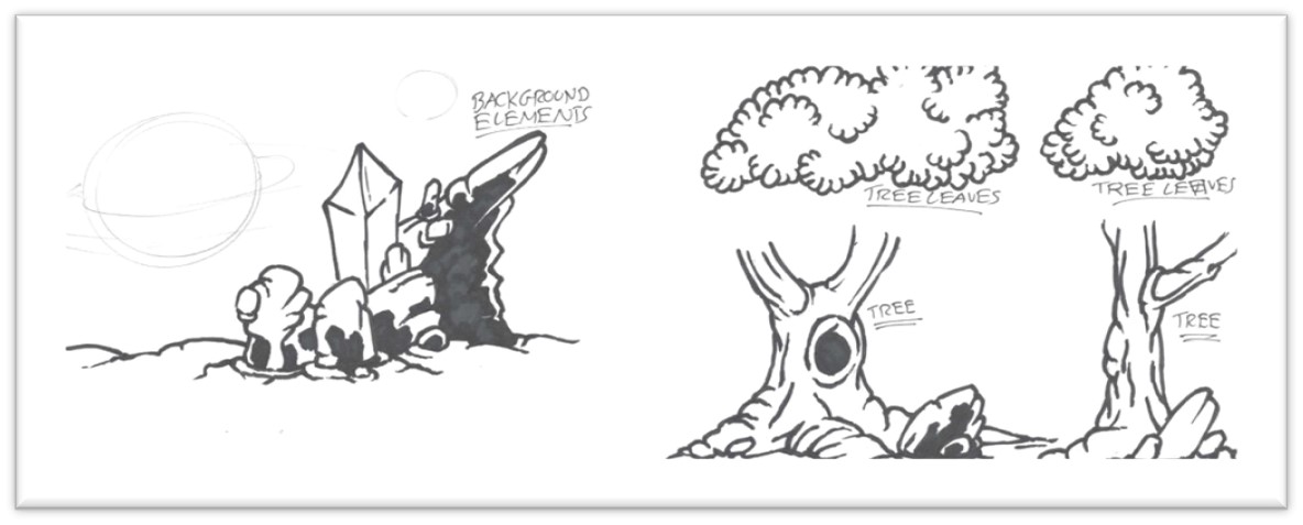
Figure 29: Some of the designs for the backgrounds (Source:
Marin Balabanov)
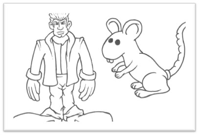
Figure 30: Some of the character designs (Source: Marin
Balabanov)
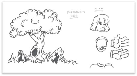
Figure 31: Designs of components that will be composited
together on the Atari STE (Source: Marin Balabanov)
Now that I drew the individual figures and the components of the
backgrounds I scanned them using a flatbed scanner attached to
my modern day MacBook Pro. This might seem contradictory to the
original plan to use only original hardware, but I could have
also done the scanning process on the Atari ST if I had managed
to find and purchase a hand scanner. I could not find a suitable
model. I then decided to scan the designs on the Mac and
transfer them to the Atari ST to color them and manually render
out each detail. This would give me flexibility to combine the
panels any way I liked, and it saved time because I would reuse
the same figure on multiple panels with only slight variations.
The same is true for the backgrounds. I could repeat the
backgrounds and overlay the relevant characters.
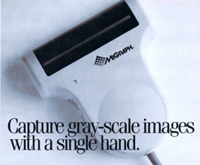
Figure 32: An ad for the MiGraph hand scanner in Start Magazine
4/1988
I scanned them on my Mac and then converted them into an old
graphics format called IFF that first used on the Commodore
Amiga. I saved the converted image files onto an SD card and
then transferred them onto the Atari ST using the UltraSatan.
Now, it is only a matter of converting them into the format of
the paint application I want to use for the finished pixel art.
I was not sure how well I would be able to draw on the Atari
Mega STE. So, before starting with the comic, I wanted to try my
hand at a “proof-of-concept.” I want to be mindful of the
limitations of the Atari Mega STE.
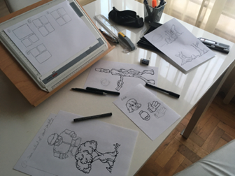
Figure 33: Layouts and character designs
(Source: Marin
Balabanov)
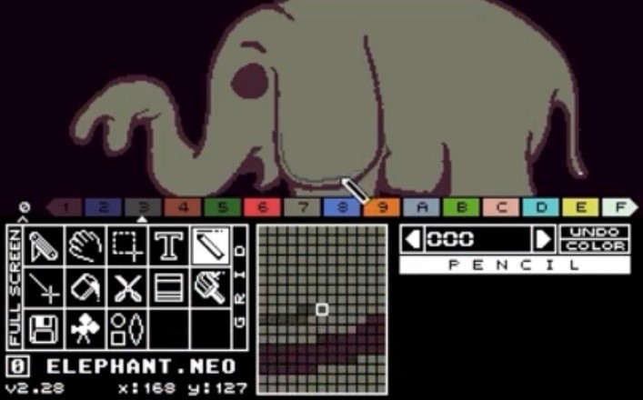
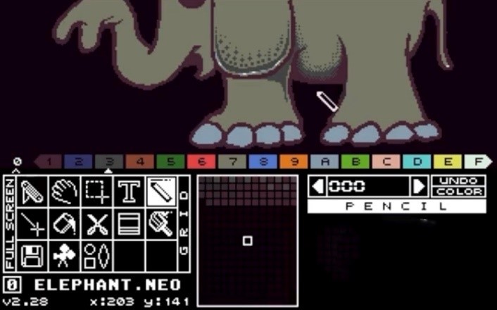
Proof of Concept
The process of pixeling every single detail is quite time
consuming and tedious. That being said, it did put me in a
trance-like state of complete focus. I worked my way through to
a finished proof-of-concept of the elephant using different
techniques to overcome the limitations. I used dithering for
areas of color transitions and I manually anti-aliased the
pixels that made up curves to offset the low resolution.
The elephant that I drew is a pivotal character in the story. I
mainly focused on getting the colors right and making sure that
the lines are cleaned up. The background will most likely be
different in the final comic than it is in the proof of concept.

Figure 34: The pen and paper design of the elephant used
as
the basis for the proof-of-concept (Source: Marin Balabanov)
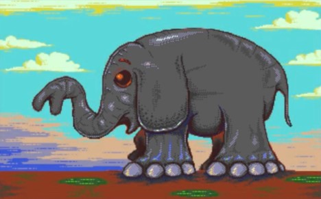
Figure 35: The steps in creating the proof of concept for the
pixel art comic in NEOChrome.
For the final comic I redrew
the elephant. (Source: Marin Balabanov)
V. Pixels all the Way
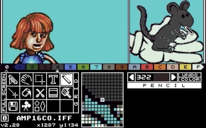
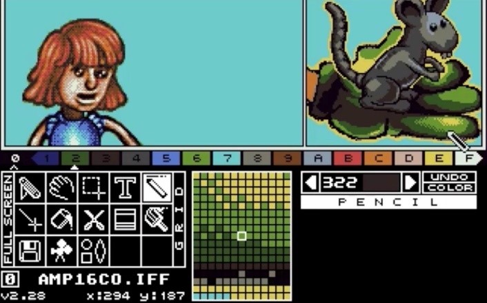
Pixeling the Main Comic
Full of energy and enthusiasm I started with the very first
panel. It would be the scene setting image with a large title.
At that time, I still wanted to call the story "The Elephant in
the Room."
A False Start
I imported the scanned contours of trees, drew a coast line and
a horizon, drew a logo like title with an elephants trunk acting
as the letter "t", cleaned up the lines, meticulously pixeled
all the colors and dithered all the shaded only to realize
that...
This was all completely pointless. This was a false start. The
scene is not set properly by showing a horizon with a sunset and
a coastline without any of our characters. And I also realized
that the title "The Elephant in the Room" is not suitable. To a
certain extent it reveals the punch line. But most of all, it
does not ring true. While the phrase "The Elephant in the Room"
usually refers to an important matter at hand that is always
overlooked or deliberately avoided, it is simply not suitable as
the story's title. I am not sure where the darn elephant is, but
most definitely it’s not in the room.
I therefore had to abort my work, scrap the panel and start
again. It did pain me quite a bit to discard a passionately
painted picture, but at least I can share it here in the project
documentation.
Figure 36: The roughly colored version of the unused opening
panel (left),
and the finished version of the unused panel with the unused
title and logo (right)
(Source: MarinBalabanov)
Drawing Panels
This time around, I'd adhere more closely to my sketched out
thumbnail layouts. The establishing shot should show the main
characters of the story and their location in a clear manner.
Additionally, it should have sufficient space for a title. I
planned the panel to show our players standing next to the
forest then the referee will later release the mouse.
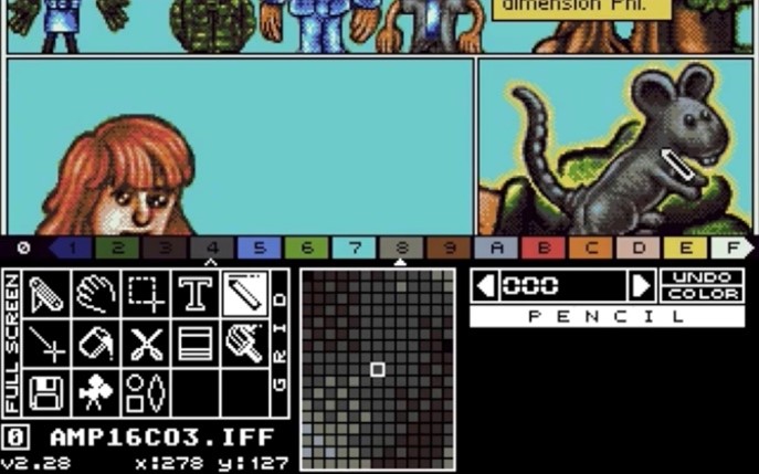
Then I proceeded panel by panel and page by page to work my way
through the story.
The method was always rather similar: I copied the scanned
elements to an empty image in NEOChrome, resized and pasted them
where they belong. I filled in the gaps in the lines and cleaned
up the contours. I filled the contours with the main color of
the element (e.g. the contours of the referee’s hair are filled
in red, the mouse is filled gray). Then I added the dark tones
that create the shadows and shades in the shapes. This was
followed by the highlights. To make the transitions smoother, I
dithered the colors across each other. After another round of
clean-ups, I anti-aliased any starkly contrasting contours.
Figure 37: Pixeling a panel from the initial coloring and
shading to the lettering
(Source: Marin Balabanov)
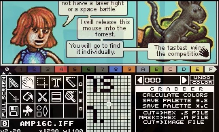
Lettering
After making another round of little adjustments like adding and
removing a pixel here and there, I started lettering the panels.
This was slightly more laborious than it would be using a more
modern paint application, because NEOChrome does not have the
concept of layers. Every letter and word will irreversibly cover
the background it is placed over once I finish entering that
line of text. I therefore needed to estimate the room necessary
for each speech "bubble" and caption, then draw the necessary
boxes to "reserve" the space. Then I selected the smallest
legible font in NEOChrome and typed the dialog and captions into
the available space. More often than not, this went well.
On several occasions, I had planned for too little space in a
panel and had to start the lettering over again. Text handling
is definitely not NEOChrome's strongest feature. The smallest
font in the application produces odd spacing between the
letters. I therefore had to manually adjust the spacing between
every individual letter after typing them. In some cases I also
changed the shape of the letter to make it better legible.
Compositing the Page
NEOChrome only allowed me to draw images of 320x200. This is an
approximately horizontally rectangular aspect ratio. A full page
requires two of these images stacked over each other. I could
not do this in NEOChrome. So, whenever I finished the two halves
of a page, I imported them into a different application:
Invision Elite Color. This is an app developed with the
successors of the Atari ST and STE in mind, the far more
powerful Atari Falcon and the Atari TT, but it nonetheless ran
on the Atari ST and the STE.
The version of Invision Elite Color I used was released in the
early 1990s and was targeted towards print designs that used the
Atari computers for desktop publishing. I never got the hang of
using Invision to draw and paint, but the feature I wanted to
use was its capability to create images of an arbitrary
resolution.
In Invision, I created a new image with a resolution of 320 x
400 and then I pasted the two halves of each page together and
saved them in the IFF image format.
Finishing the Comic
The old saying goes that every journey starts with a single
step. Once the journey of pixeling each panel and every page was
underway, I learned to complete each step faster and more
confidently.
After around three weeks of on and off pixeling during free
time, I finished the comic story. The journey was nearly over.
Happily and proudly I could say: The project is finished.
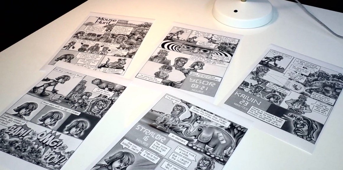
Figure 38: The finished comics pages. Let's take a look at them
in detail in the chapter after the next.
(Source: Marin
Balabanov)