The Unrestrained Energy of Rob Liefeld
Why I Still Love These Wild 1990s Comics
Rob Liefeld may never have been the most polished or technically precise artist, but in the late '80s and early '90s, his comics were pure energy on the page. Explosive, chaotic, and gloriously excessive, they captured the imagination of a generation of readers. For me, his five-year run of unrestrained creativity remains unforgettable.
September 2025
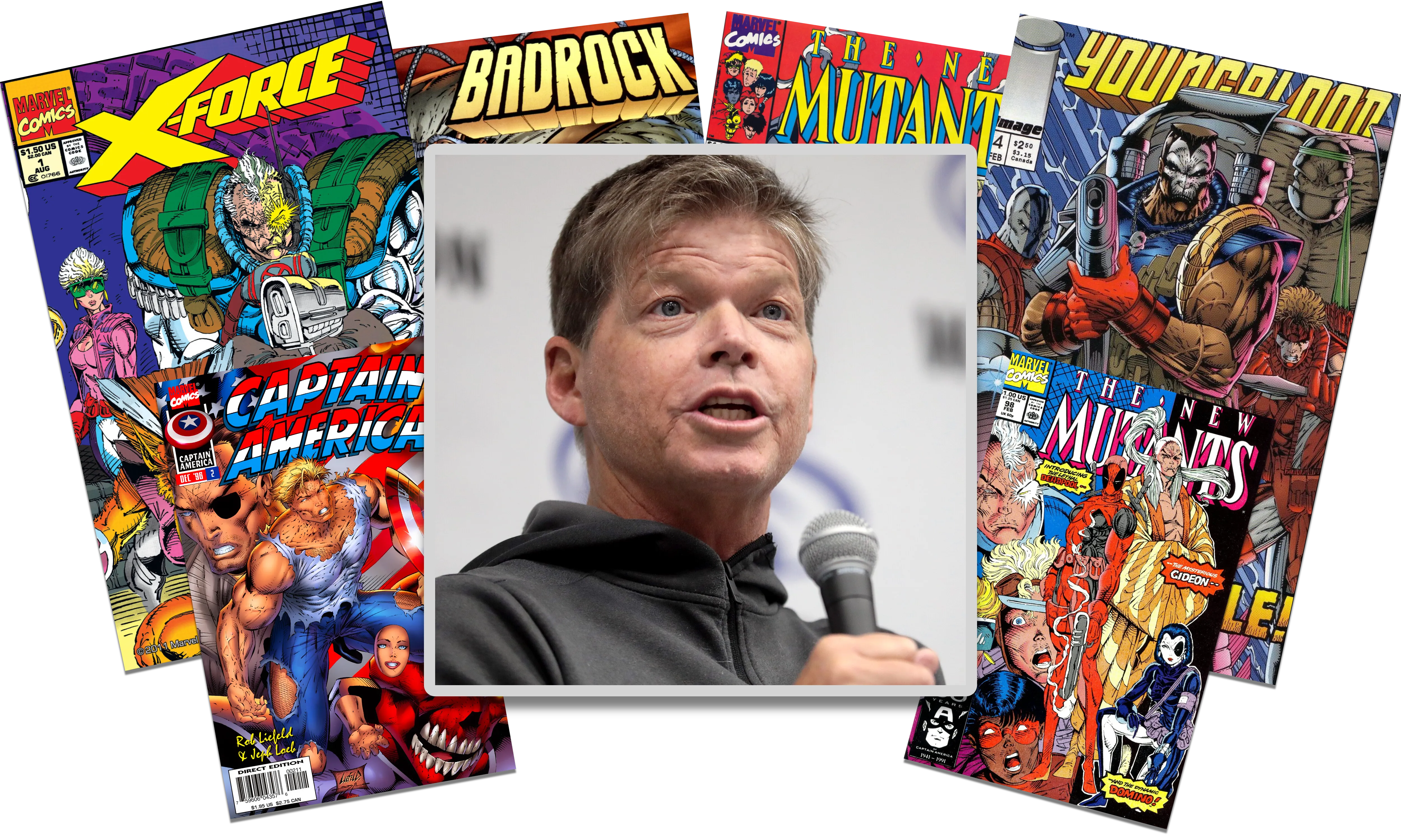
The one and only Rob Liefeld and his comicbook covers (Photo source: Wikipedia)
What Makes a Good Artist?
What if I told you that a good artist doesn't necessarily need to know anything about anatomy or composition, and his drawings don't even have to look good in any conventional way to find admirers and fans? Enter comic book artist Rob Liefeld.
In the late 1980s and early 1990s, there was no way around Rob Liefeld if you were a Marvel Comics reader. He was brash, and he was bursting with style. For all his flaws (and there were so many!), Liefeld's art was charged with an unbelievable energy that influenced the look and feel of superhero comics at the time. And for me, that made him unforgettable. While I appreciate the refined art of George Pérez, John Byrne, Walt Simonson, Art Adams, and Frank Miller, I have an inexplicable affection for the art of Rob Liefeld.
Liefeld first broke into comics at DC, drawing Hawk and Dove in 1988. It was a modest debut, but it put him on the map. Very quickly, Marvel came calling.
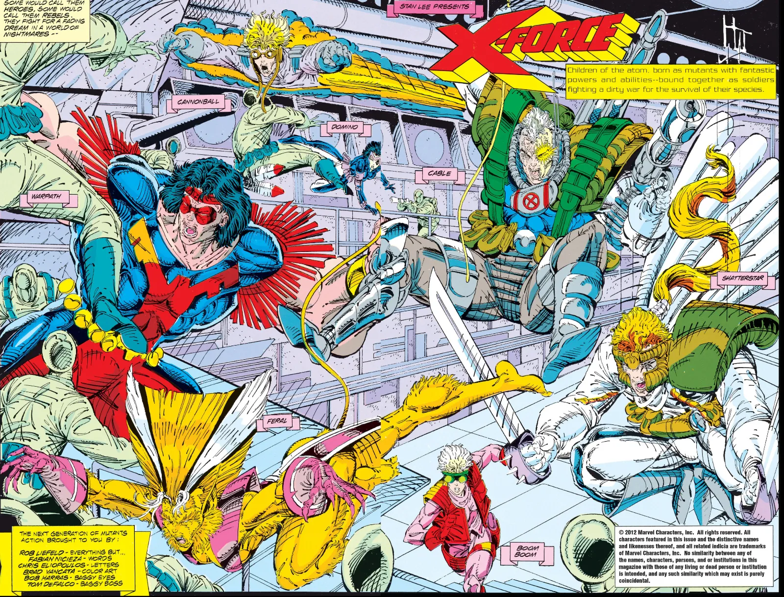
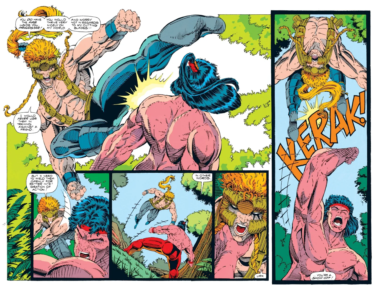
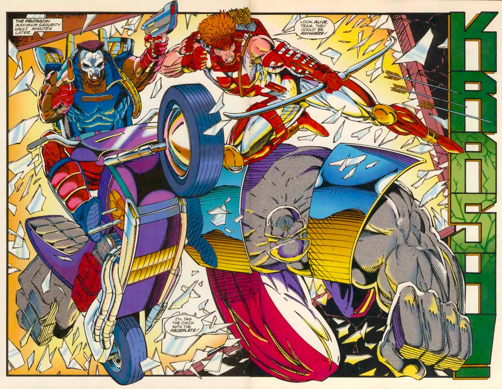
Double page spread from X-Force #3, art by Rob Liefeld (very much inspired by a double page spread by George Perez, though not an outright swipe)
The New Mutants and the Birth of X-Force
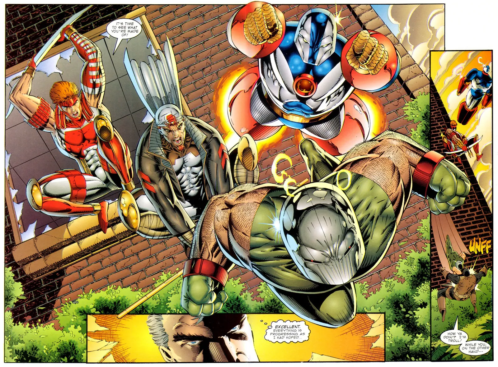
Liefeld hit his stride when he took over penciling duties on The New Mutants in 1989. The book had been limping along, but with his arrival, sales suddenly picked up. At first, he was only penciling, with others handling inks, but soon he took over the full visual storytelling, penciling, inking, and even plotting the book. By 1991, Marvel relaunched the series as X-Force, with Liefeld at the artistic helm.
And along the way, Liefeld created two characters who would go on to become icons: Deadpool and Cable. At the time, they were mostly surface-level designs with cool weapons and quippy personalities, but later creators would flesh them out into the characters fans love today.
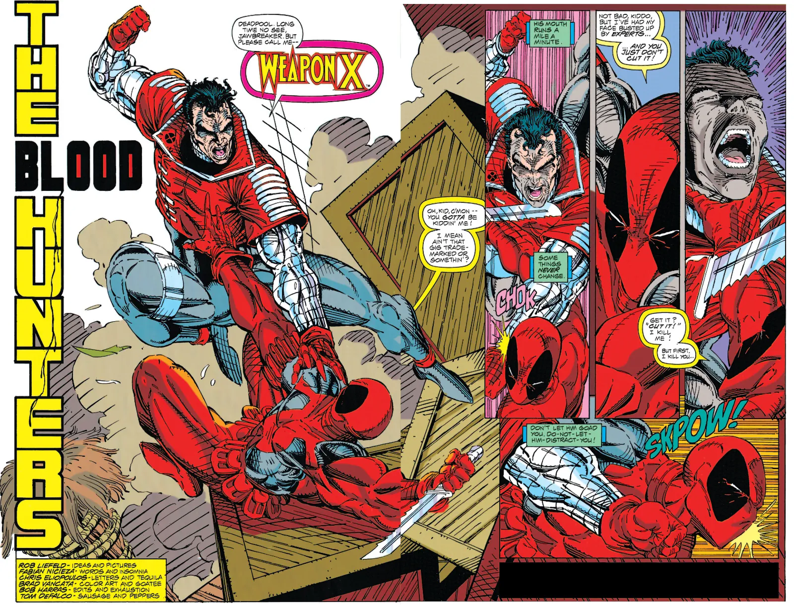
One of the first appearances of Deadpool in X-Force #2.
Now, nobody has ever claimed Rob Liefeld was an anatomy expert. His postures were exaggerated, his facial expressions either strained or oddly indifferent, and his proportions frequently baffled medical science. Yet his characters radiated something unique: raw, kinetic force. They exploded off the page. His art wasn't subtle, it wasn't elegant, but it was alive.
Part of what made it so exciting was his sheer disregard for convention. His panel layouts were unconventional and sometimes outright crazy. He didn't prioritize clear storytelling the way many artists did. Instead, he went for spectacle: poses that shattered panel borders, muscles stretched to impossible limits, bodies twisted into dramatic contortions.
And I’ve always admired this about Liefeld’s art! It certainly makes no attempt to be realistic... and that is part of its strange charm. His work does not try to depict the real world, nor does it aim to construct a carefully ordered fantasy or sci-fi universe with consistent rules. Instead, it aspires to one thing above all else: fun, enthusiastic action.
None of his drawings are grounded, but instead they are bursting with excitement. Liefeld’s pages are less about coherence and more about capturing the sensation of a twelve-year-old’s imagination running wild with superheroes. And I respect that with every fiber of my being. I also know it is not for everyone. But for those of us who connected with it, the appeal is undeniable.
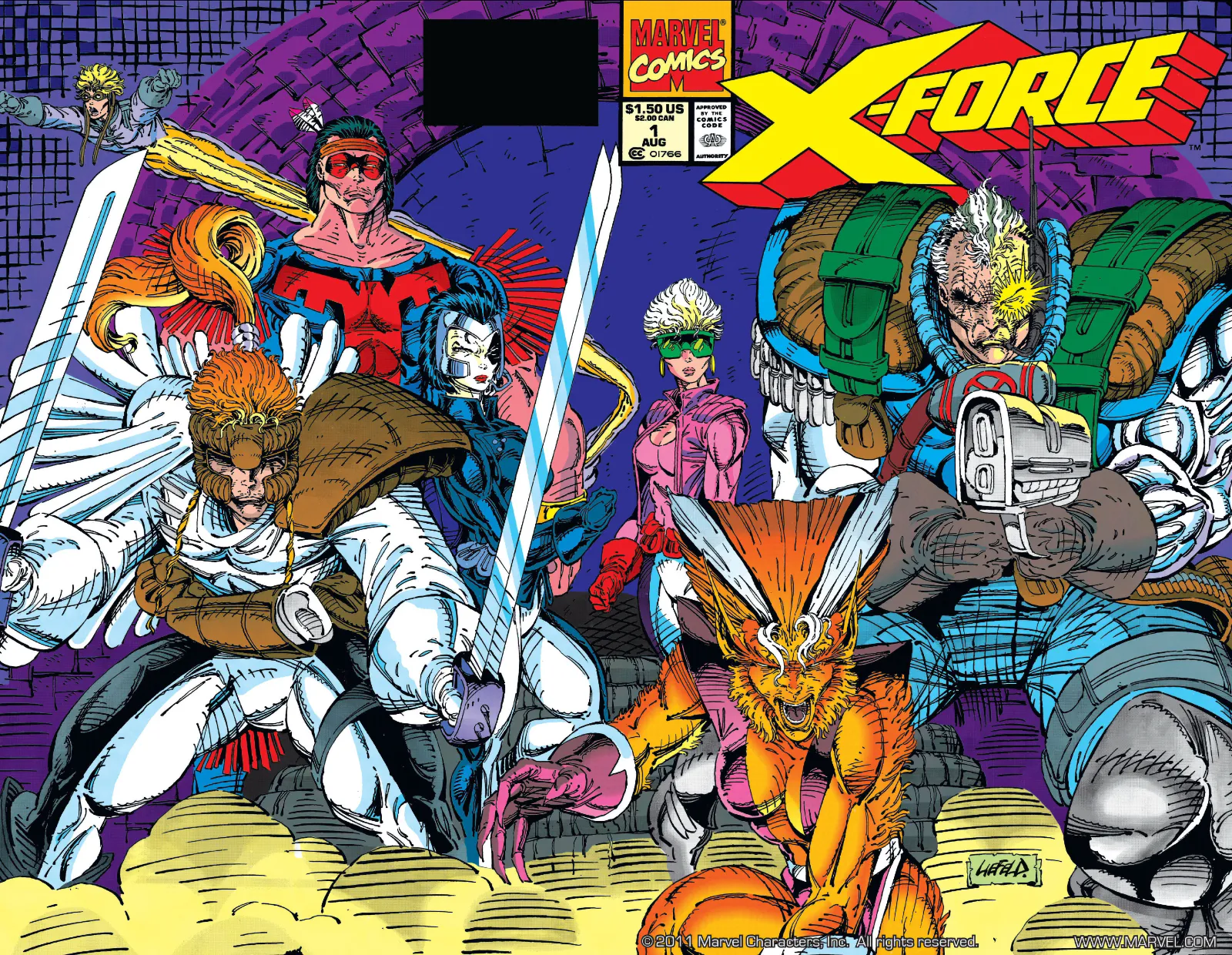
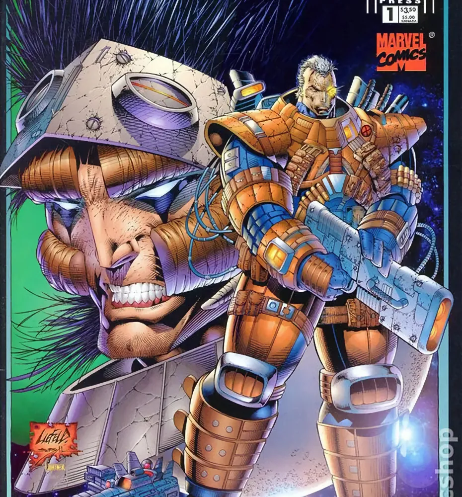
The legendary cover of X-Force #1 by Rob Liefeld. At the time, one of the best-selling single issues in superhero comics. Note Liefeld's typically wild hatching, particularly around Cable's nether-regions. Shocking!
His male heroes were impossibly muscular, while some of his female characters had impossibly thin waists, legs that seemed to stretch forever, and breasts that defied physics. Feet, when they appeared at all, were often drawn tiny, as if Liefeld was trying to avoid them. Some characters ended up with torsos so compacted that they looked super-deformed, a term borrowed from manga and anime that describes figures with squashed, exaggerated proportions, often used for comedic effect. But in Liefeld's case, the effect was unintentional, adding another layer of strangeness to his figures.
Another hallmark of Liefeld's art was his cross-hatching. And I don't mean subtle shading! His pages were filled with layers of jagged lines piled on top of one another, creating a kind of spectacular craziness that went far beyond any reasonable sense of texture or depth. Inspired in part by the detailed work of Arthur Adams, Liefeld pushed it into overdrive, covering muscles, costumes, and even empty backgrounds with the restless sparkle of nonsensical lines. It certainly didn't always make visual sense, but it made the art feel alive and vibrating with intensity.
And then there were the details: characters bristling with more pouches than any soldier could ever need, speedlines that didn't quite line up, swords held at impossible angles, and massive futuristic guns with missing triggers or grips that seemed unusable. It was excess on every level... wild, strange, and often nonsensical.
And yet… it was mesmerizing (and I mean that completely unironically).
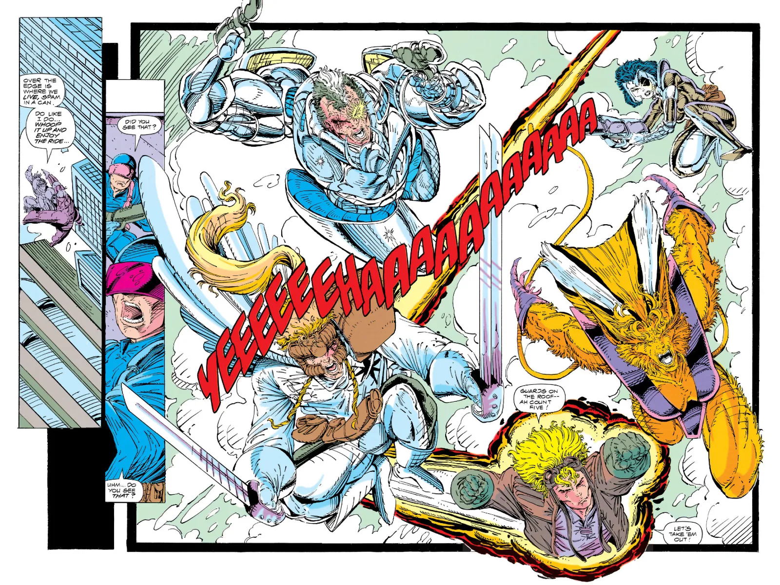
Double page spread from X-Force #3, art by Rob Liefeld
Liefeld Hall of Fame: The Infamous Quirks
- Male characters with super-deformed torsos that looked unintentionally squashed.
- Female characters with impossibly thin waists.
- Cross-hatching the heck out of a drawing.
- Page after page of utility pouches.
- Swords drawn at impossible angles.
- Shameless swipes of other artists' art.
Love them or laugh at them, these quirks are part of Liefeld's unmistakable signature.
The Stories: Bombastic and Messy
The stories? Honestly, they were mediocre at best, incomprehensible at worst. But it almost didn't matter. During his heyday, Liefeld filled every page with so many exciting, over-the-top elements that you couldn't help but be swept up by it. Each panel was an adrenaline hit, a bombastic collage of superhero spectacle.
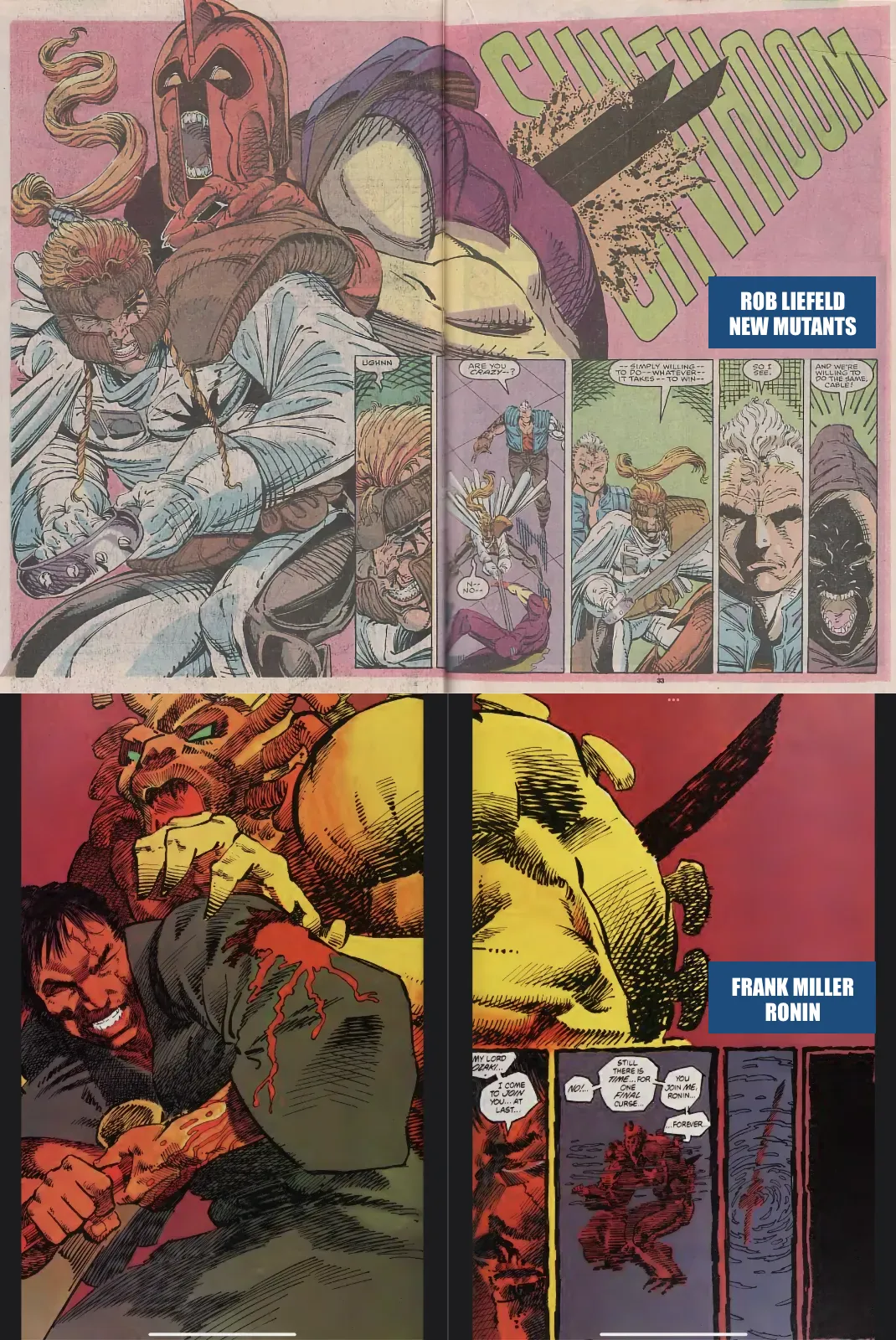
His style reminded me of a rougher, less refined version of Art Adams. Sure, he swiped poses and layouts from George Pérez, Frank Miller, and John Byrne but he gave them back supercharged.
When New Mutants transformed into X-Force, Liefeld's style went into overdrive. Those early issues, especially X-Force #1 to 7, were wild. Messy? Definitely. Over-the-top? Absolutely. But also electric. They carried a bombastic spirit that only a young artist with too much caffeine and too few boundaries could deliver.
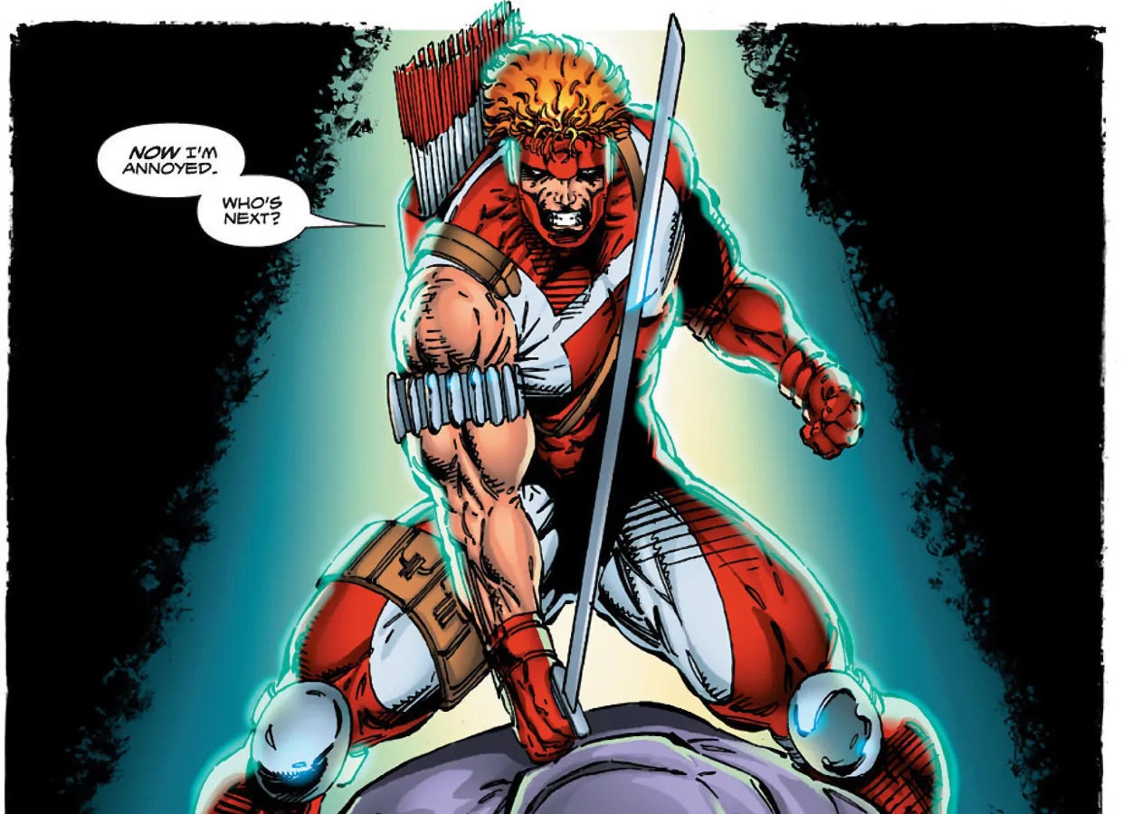
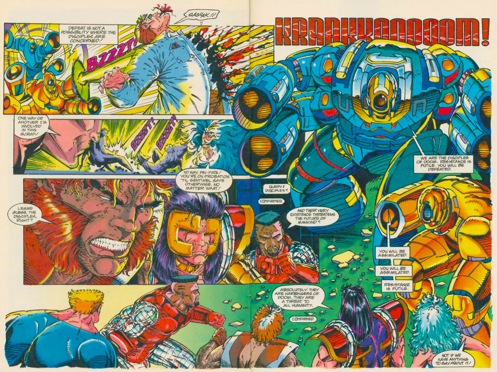
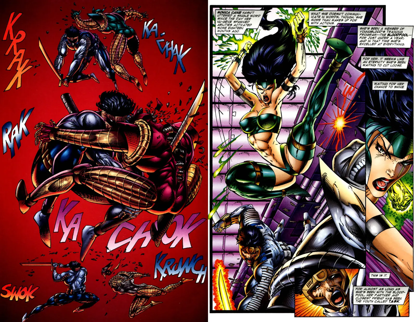
Double page spread from X-Force #6 showing a chaotic battle between the gladiator warrior with the excentric hair-do Shatterstar and the super-strong Warpath.
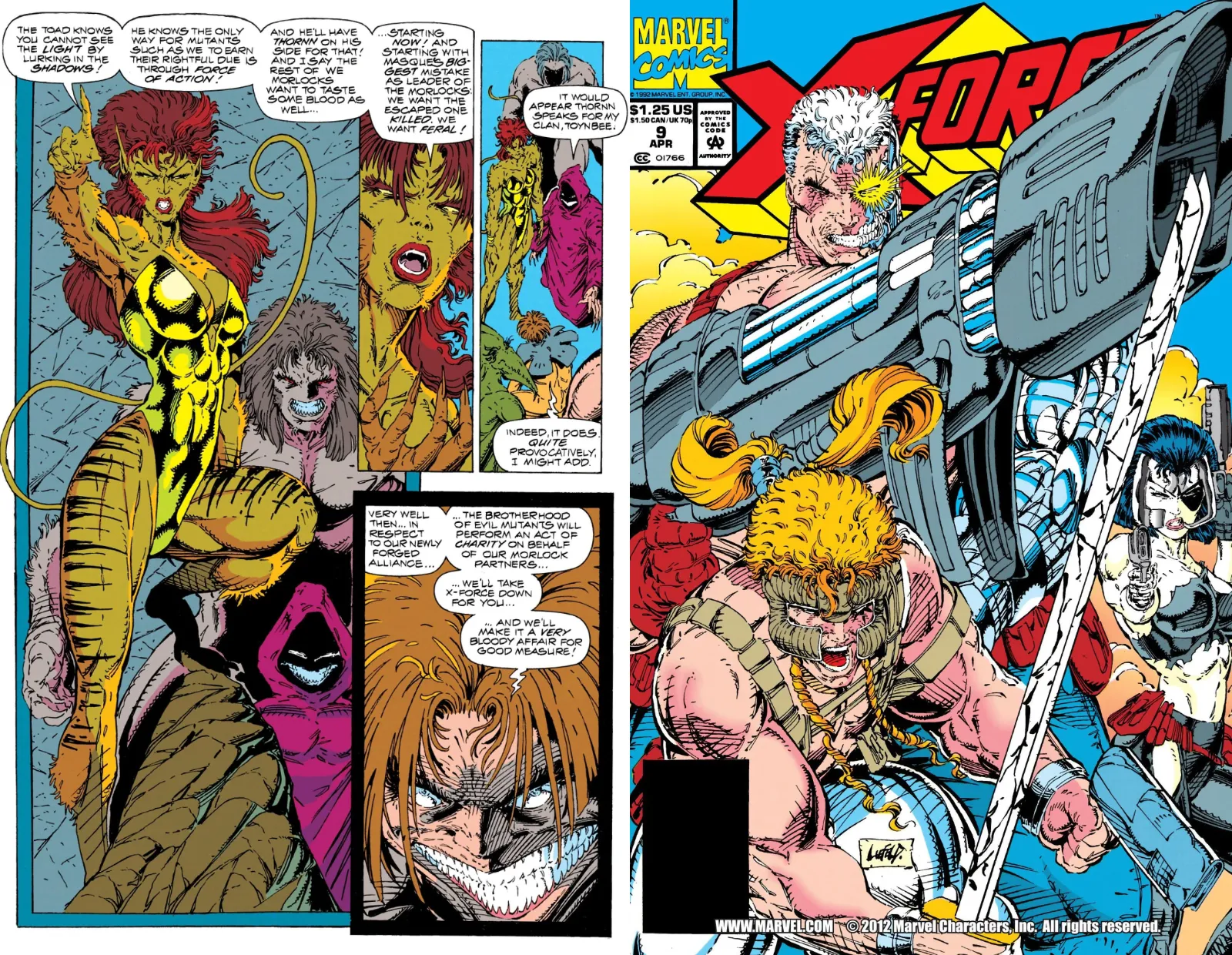
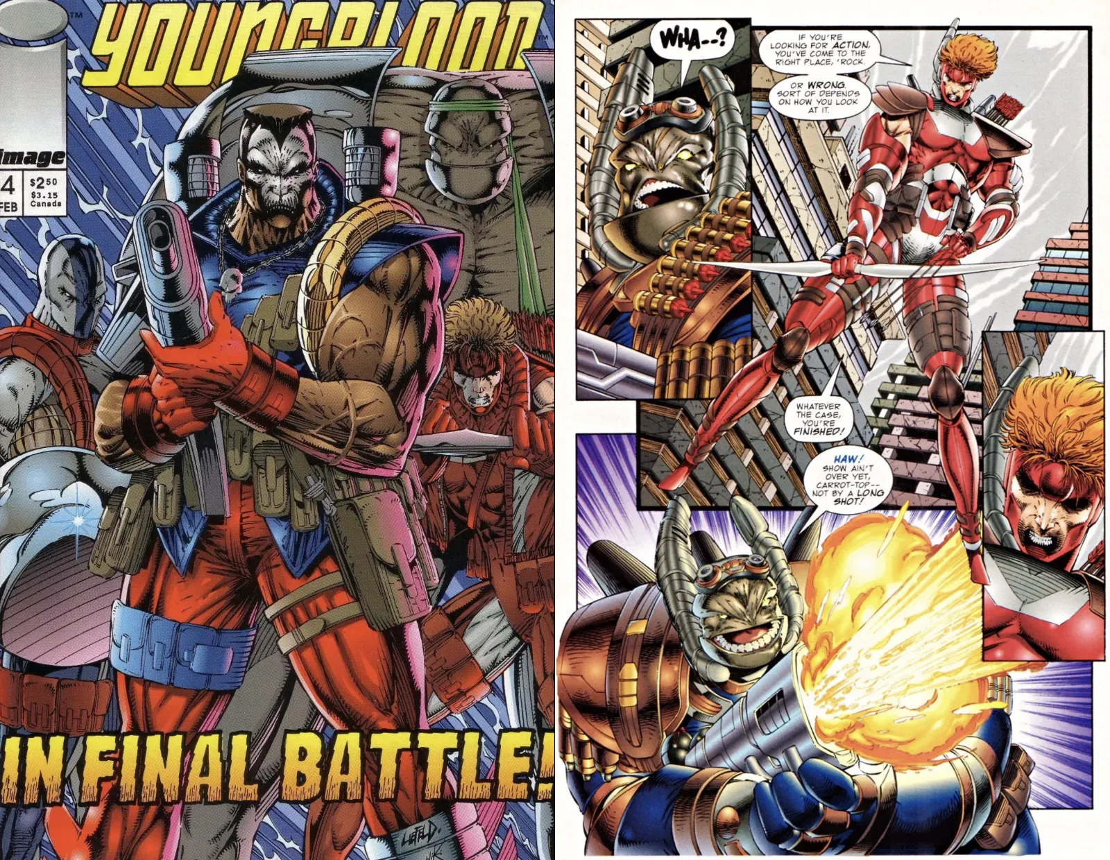
More remarkable examples of Rob Liefeld's artwork (interior page from X-Force #6 and the cover of X-Force #9).
Youngblood and the Image Revolution
And Liefeld wasn't just shaking up Marvel. Alongside other rising stars like Todd McFarlane, Jim Lee, and Marc Silvestri, he left the company to form Image Comics in 1992. Liefeld's Youngblood was the very first Image release. And if X-Force was crazy, Youngblood was pure chaos.
There was no editorial oversight, no Marvel guardrails. The stories were laughably bad, but the artwork (particularly in issues #2 to 4) was intoxicating. Explosive, captivating, and, yes, utterly juvenile. But that juvenile spirit was part of its charm.
After those first few issues, Liefeld focused on building his own Extreme Studios, mentoring young artists and launching more titles under his brand. He returned to Youngblood in 1994 with issue #6, and this period is, to me, the pinnacle of his art. The wild energy was still there, but with a slightly more refined edge. His pages still seemed like they could barely contain themselves, bursting at the seams with action, fire, and fury, yet he managed to actually tell stories (even though that wasn't what I came to his work for).
A more refined Liefeld: Youngblood #6.
The proof that technique and anatomy don't matter when the energy is there: a double page spread from Youngblood #2 by Rob Liefeld
Later Work and the Fade of the Magic
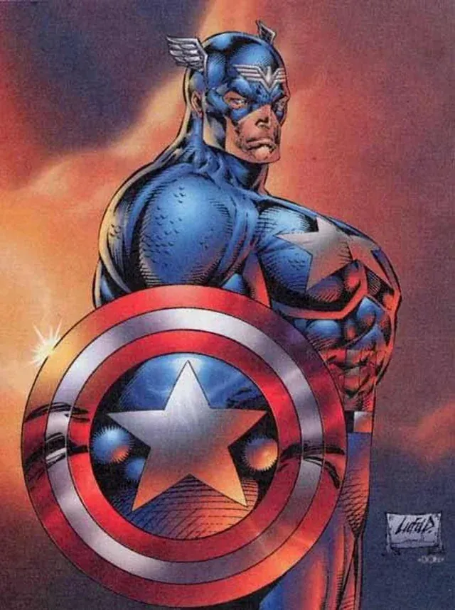
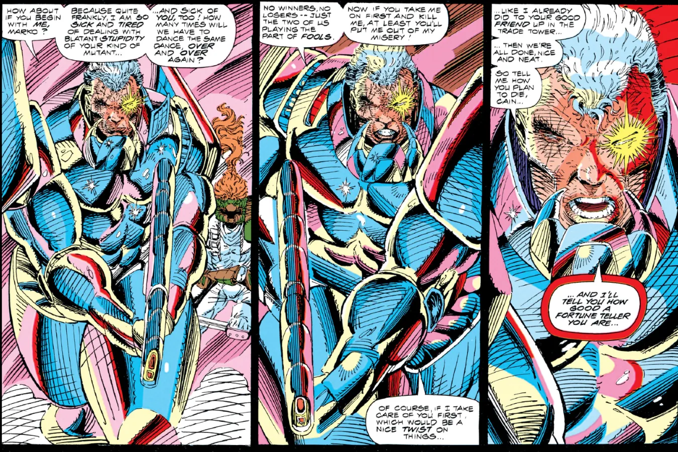
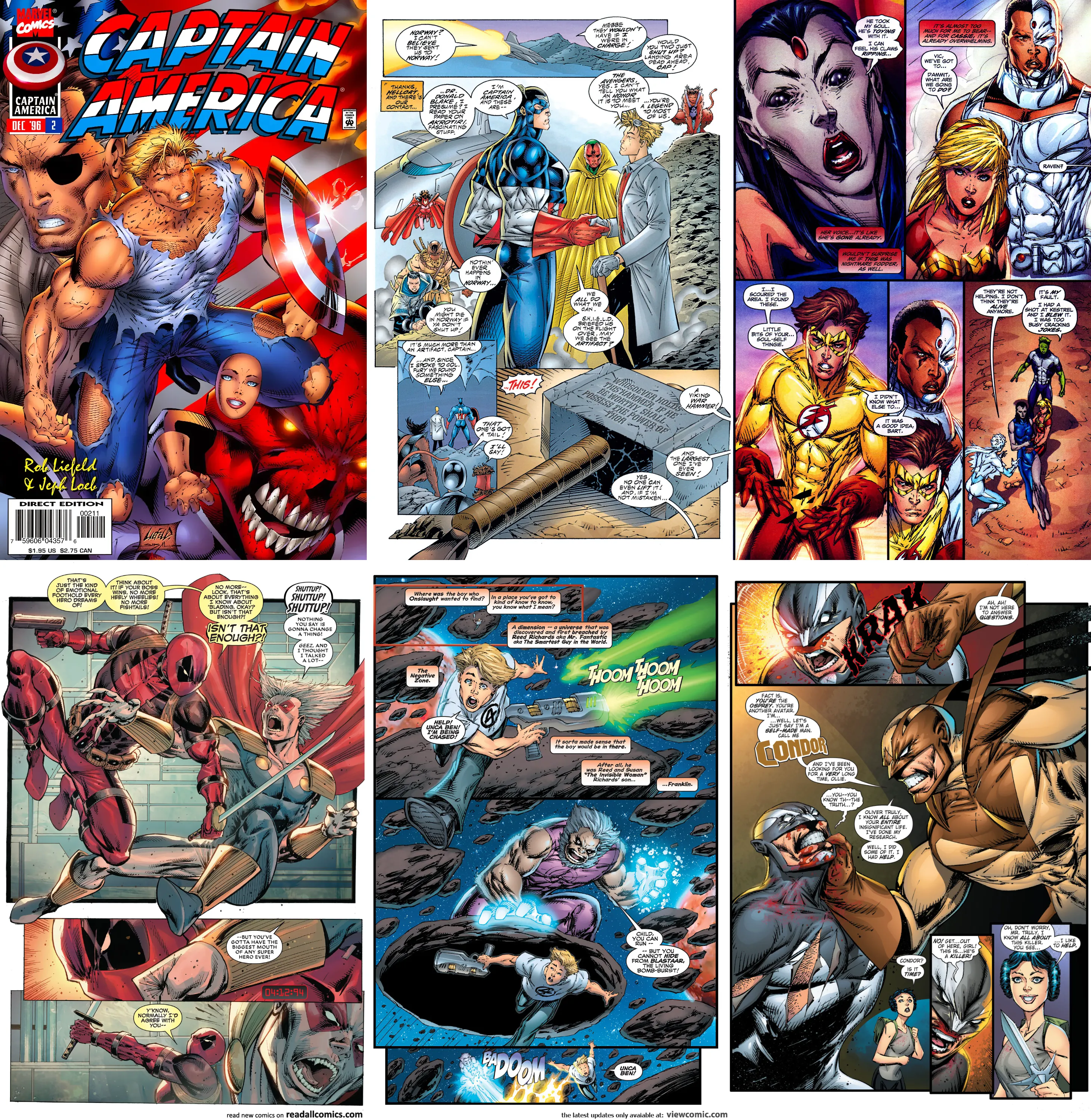
Liefeld eventually returned to Marvel in the mid-1990s to relaunch Captain America and The Avengers as part of the Heroes Reborn initiative. Unfortunately, his artwork by then had become sloppy even by his standards. The hollowed-out, superficial poses remained, but the pages no longer crackled with energy. Instead of packing the panels with his trademark chaos, he relied more on digital coloring to carry the artwork.
In Captain America, Liefeld swiped even more blatantly from artists like Jim Steranko and Jack "The King" Kirby. Sales were strong at first, but he left before finishing his contract. Even though I bought this series, I no longer found anything interesting in his artwork. The one exception was Captain America #6, a wonderfully bizarre crossover where Cap teamed up with Cable to fight MODOK (the "Mechanized Organism Designed Only for Killing" created by Jack Kirby). Against all odds, that issue managed to capture faint echoes of Liefeld's former greatness. For a few pages, at least, there was a glimpse of the explosive detail and manic energy that once defined his art.
But for me, that issue marked the end of an era. The five fabulous years that made Liefeld matter to me were over. These were years of explosive action, wonderfully strange drawings, and a bottomless well of inspiration.
Afterward, he would continue to work across the industry: building up Extreme Studios, launching Maximum Press and Awesome Comics, and returning occasionally for runs on Cable at Marvel and even Teen Titans and Hawk and Dove at DC. I would peek into his work now and then, but the magic was gone. Yes, he had improved some anatomy, yes, his faces weren't as template-based anymore. But the storytelling was weak, the sloppiness overwhelming. The shine was gone.
I started to fall out of love with Liefeld's work in his later phase.
From top left to bottom right: Captain America vol. 2 #2 Cover, Avengers vol. 2 #1, Teen Titans vol. 3 #28, X-Force: Killshot #1, Onslaught Reborn #1, Hawk and Dove Vol. 5 #2
Looking Back
That's the Liefeld I remember: not the technically skilled craftsman (he never was), but the restless, unrestrained creator who poured raw excitement into every panel. His comics were messy, inconsistent, even ridiculous. But they were also loud, fun, and brimming with life.
And for me, as for a young comics reader in the early 1990s, that was more than enough.
Exquisite chaos of my favorite Liefeld era: the Youngblood team jumping into action in Youngblood #2, art by Rob Liefeld
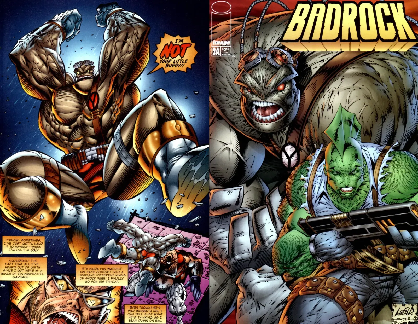
Action exploding in the art by Rob Liefeld (from Badrock #1 and #2)
Drawing Like Liefeld
In 2014, I even recorded a quick YouTube video with my attempt at drawing like Rob Liefeld. It ended up being one of the most-watched videos on my YouTube channel.
A Sidenote on Taste
As a sidenote, my affection for Rob Liefeld's early '90s work doesn't mean I'm blind to his shortcomings or controversies as an artist and industry figure. I'm fully aware of his artistic insufficiencies: the anatomy issues, the chaotic storytelling, the polarizing reputation he's carried over the decades.
In fact, I deeply admire the craftsmanship of more serious superhero artists like Jack Kirby, John Byrne, Art Adams, Walt Simonson, George Pérez, and Bryan Hitch. I absolutely devour the works of writers such as Alan Moore, Grant Morrison, Warren Ellis, and Brian K. Vaughan, and I'm just as passionate about indie voices like Robert Crumb, Pete Bagge, Dan Clowes, and Dave Sim.
In that sense, my enduring fondness for Liefeld's dazzling bombast is something of an outlier in my tastes. And I embrace it wholeheartedly as a guilty pleasure.
Rob Liefeld's foreboding cover for Youngblood #4 and an interior page from Team Youngblood #7 featuring his creations Badrock and Shaft.
Fight, fight, fight as you only can in a comicbook by Rob Liefeld (interior pages from Youngblood #10)
All characters are owned by their respective creators and copyright holders. This article is a personal reflection and does not imply any endorsement or affiliation with Rob Liefeld or any associated entities.